Gold Leaf Love

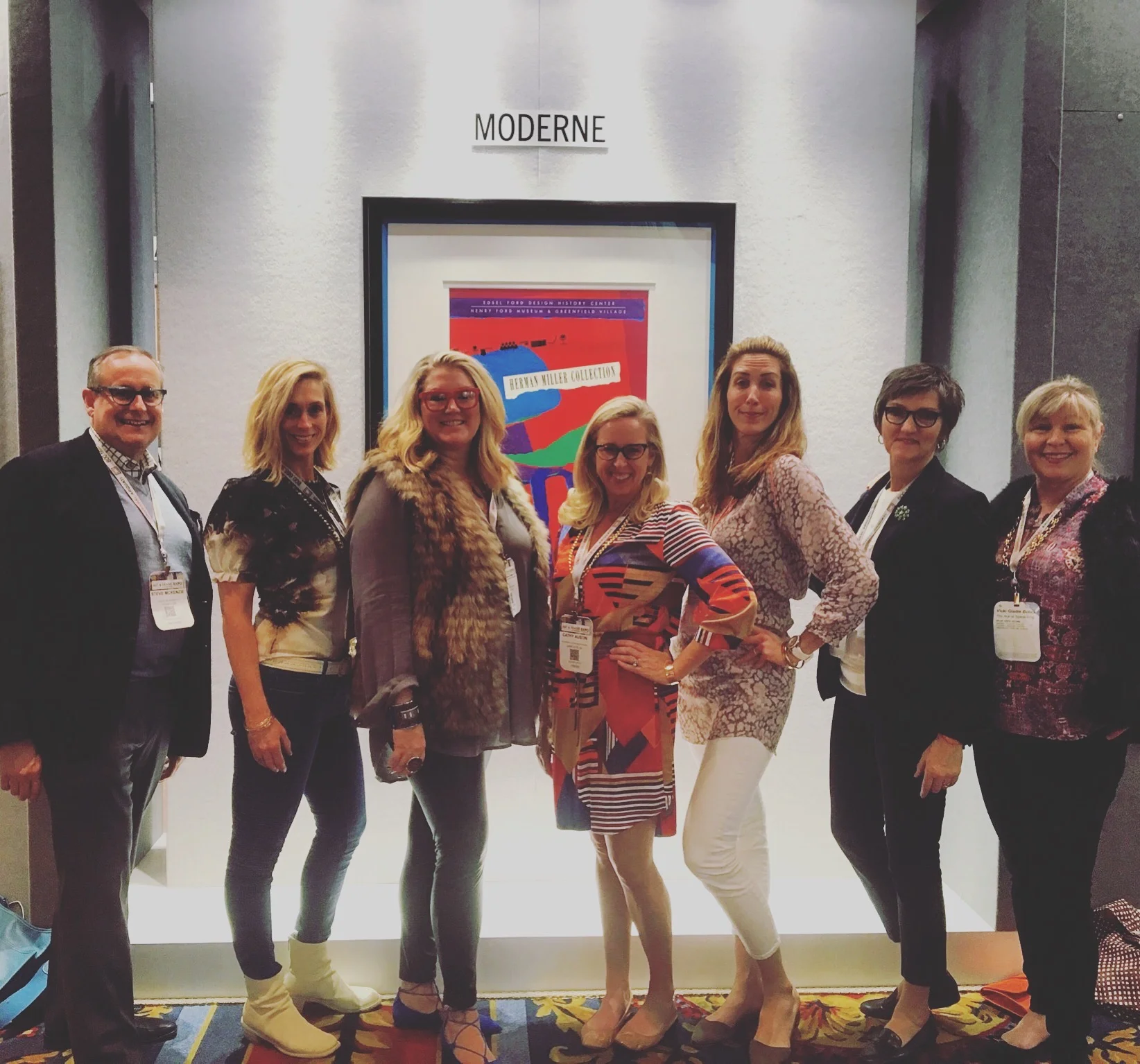
We recently had the great pleasure of attending the West Coast Art & Framing Expo with a group of interior design tastemakers (including our girls Holly, Cathy & Vicki) all of whom had been invited by Steve & Jill McKenzie. In his former life, Steve was CEO of Larson Juhl, and he was asked by the WCAF founders to bring a few of his interior designer friends down to the Paris hotel in Las Vegas to increase interest and excitement about the framing industry and the tremendous creative opportunities that framing affords us... 

CLOTH & KIND // Gold Leaf Love
Practicing our 'popping & locking' technique!

... and let us just tell you, we left extremely excited about so much of what we saw! Our brains are literally spinning with ideas of ways we can truly make our client's works of art shine. We'll have a few Journal posts in the coming weeks to recap our time in Vegas, but absolutely have to start by telling you about the two artisinal framing companies that made our hearts race.  

GOLDLEAF FRAMEMAKERS

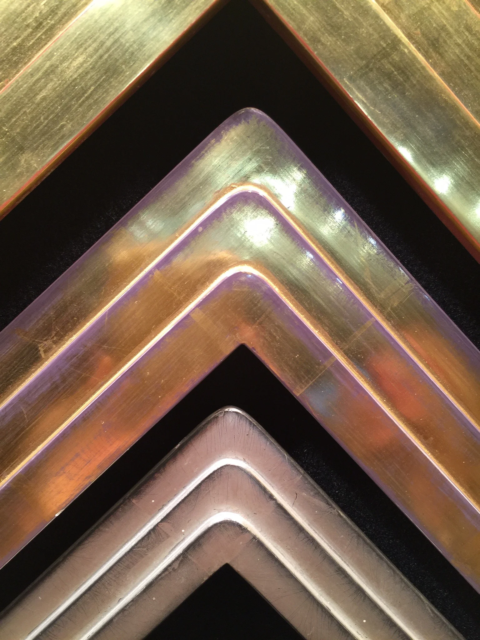
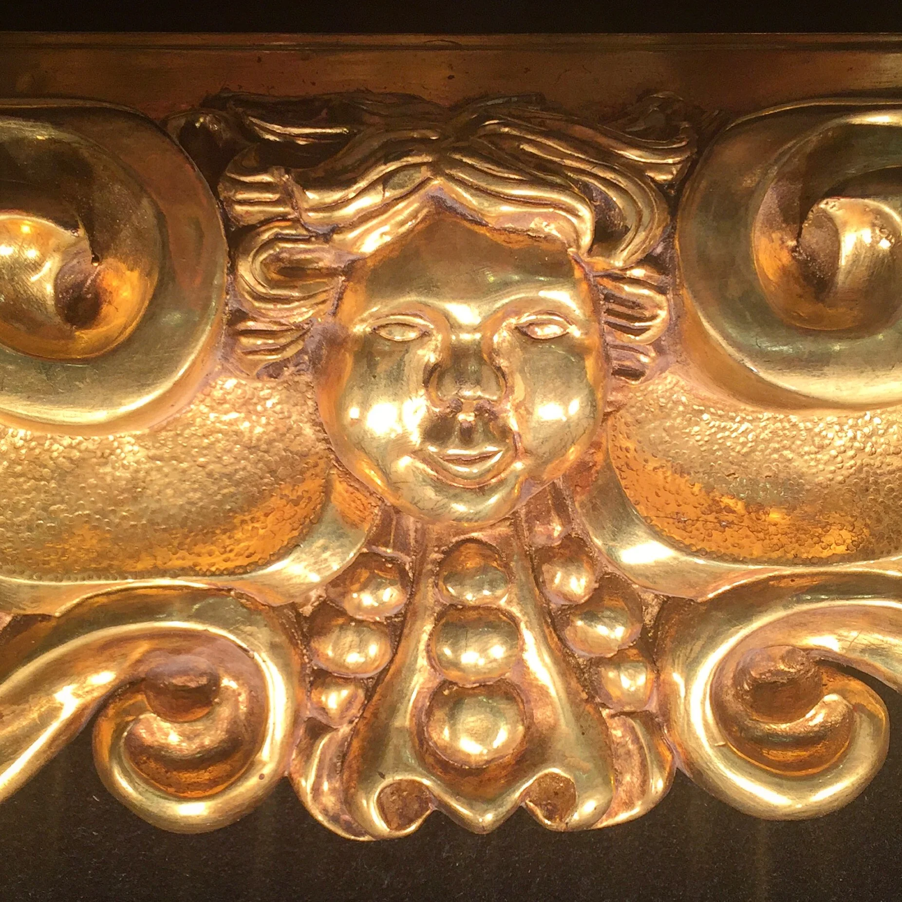
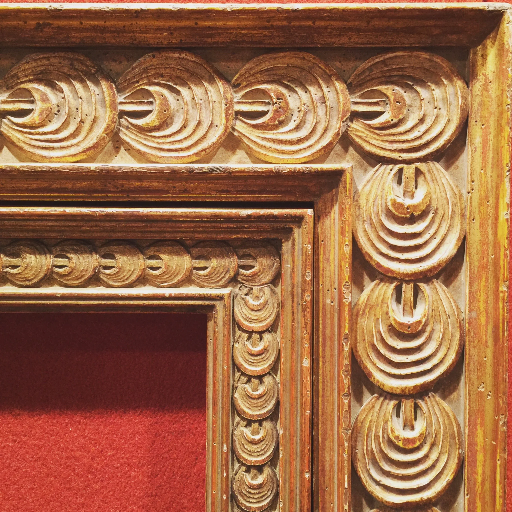
First, Goldleaf Framemakers out of Santa Fe, New Mexico. There seriously are not be words to adequately describe how stunningly gorgeous the work of  is, but these pictures will help us convey our sentiments.

Marty Horowitz, the genius craftsman behind this company, literally wrote the book on gold leaf framemaking, as he's been well known in the gilding industry for many years, and his book "An Introduction to Water Guilding" has become the bible for guilders internationally. His work is un-be-lievable! 

He also happens to be a super cool guy, which makes the prospect of working with him on custom projects just darn fun. 

Go peruse the site for more inspiration in any number of distinct historical styles including Impressionist, Italian, Spanish, Dutch, French, Contemporary / Modernist, American & Concerto... and contact Marty directly for any wild hairbrained creative framing idea you may have. Custom is right up his alley and he's got the skills to make it happen.

RHONDA FEINMAN CUSTOM FRAMES

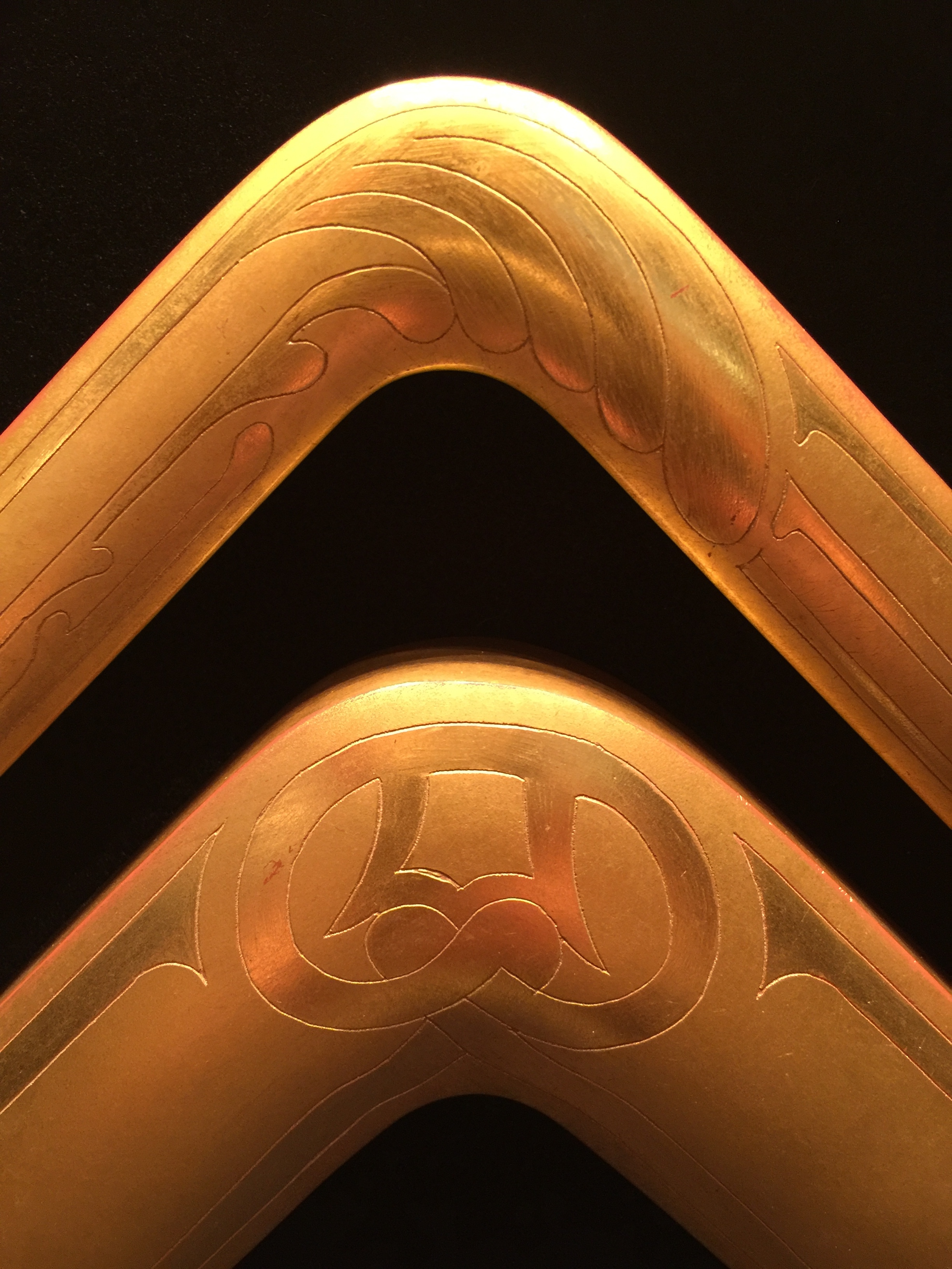
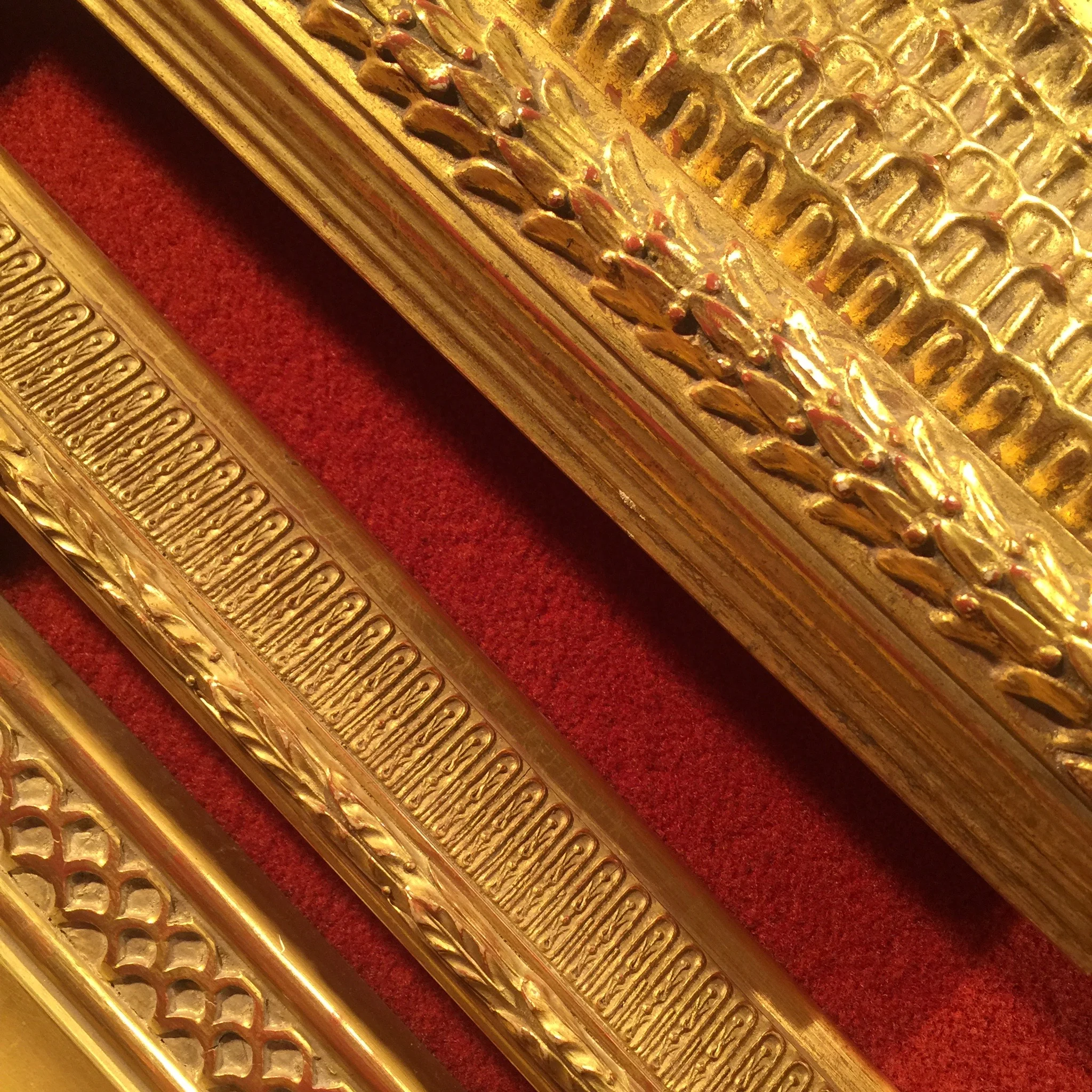
Second, the impeccable work of Rhonda Feinman. Just like Marty, Rhonda uses only genuine gold leaf on her handcrafted frames, and they are breathtaking. This pattern below, which we spied at her booth at WCAF, had us completely entranced. It's available in a wider version as well as a narrower version (shown here, nested together) - both amazing!

All of Rhonda's custom frames are made in their NY facility with the utmost respect for the legacy of centuries of craftsmanship in frame making. Artisans at the company hand carve, cast and apply decorative composition ornament, then guild with only genuine gold leaf to produce sensitive and faithful reproductions of fine antique frames. 

Also very well known for their repair and restoration work of antique frames, Rhonda Feinman is where it's at when it comes to recreating lost ornaments, cleaning and refinishing or even completely resizing or replicating original antique frames. 

More reports from our time at the WCAF show coming soon, but in the meantime we'd love to hear from you on your favorite framing resources, tips, ideas or questions. Leave a comment below.

IMAGE CREDITS // All photos taken by Krista & Tami of CLOTH & KIND except first image of the Paris Hotel and fifth image of a Goldleaf Framemakers frame which were taken by Holly Phillips of The English Room.  SOURCES // Goldleaf Framemakers & Rhonda Feinman Custom Frames.

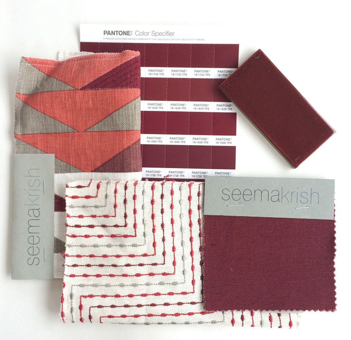
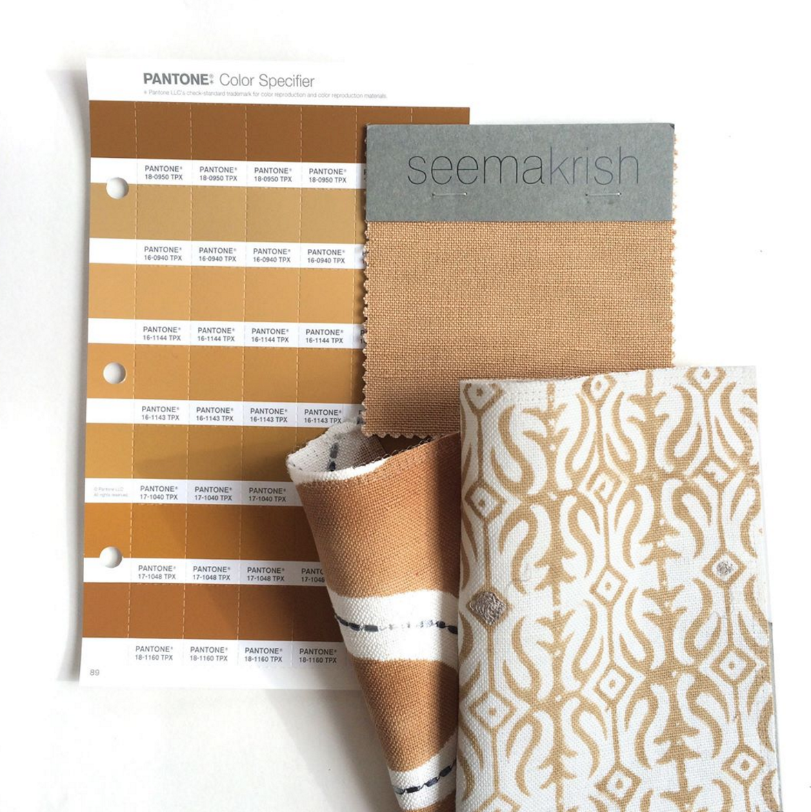
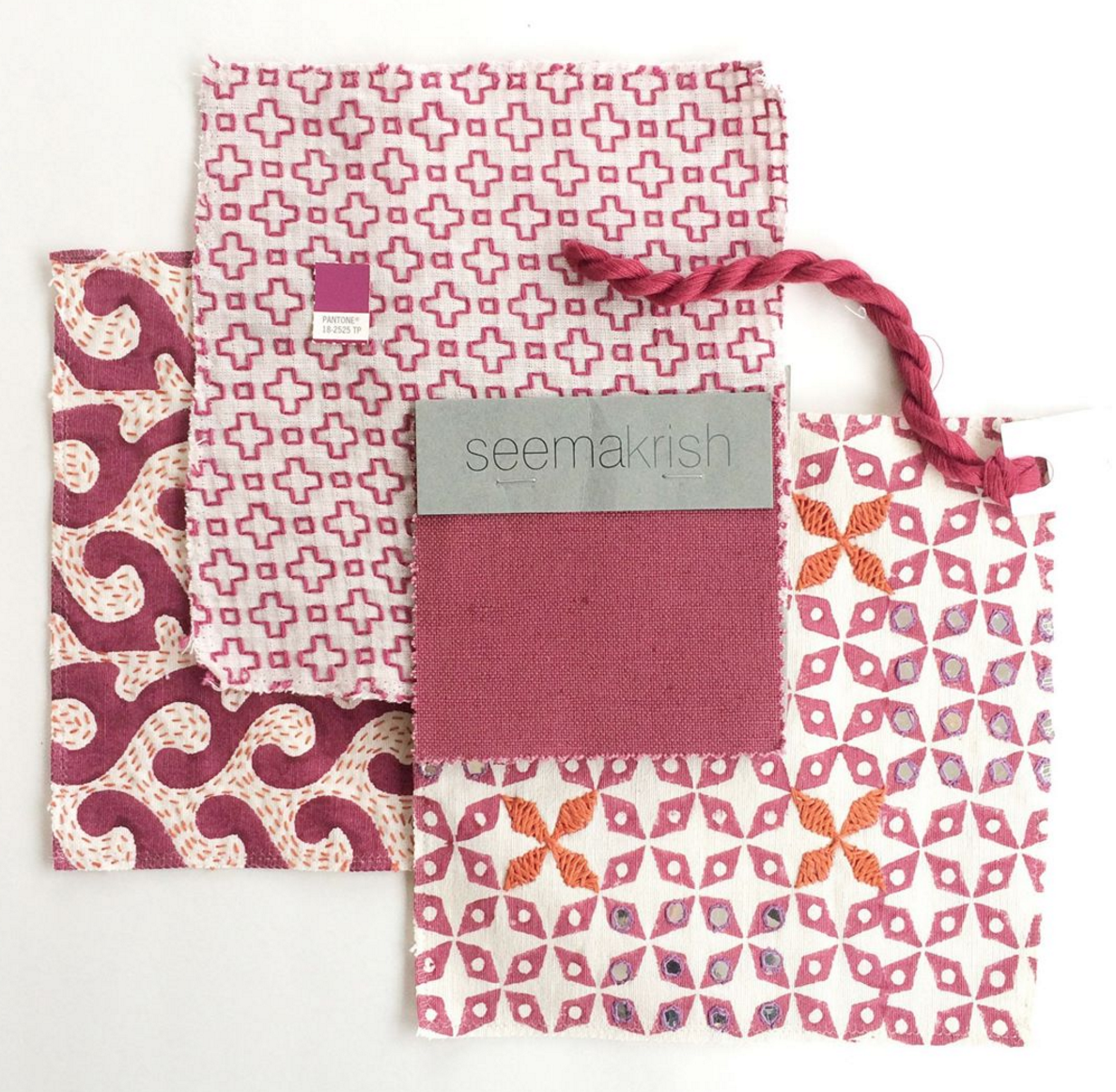
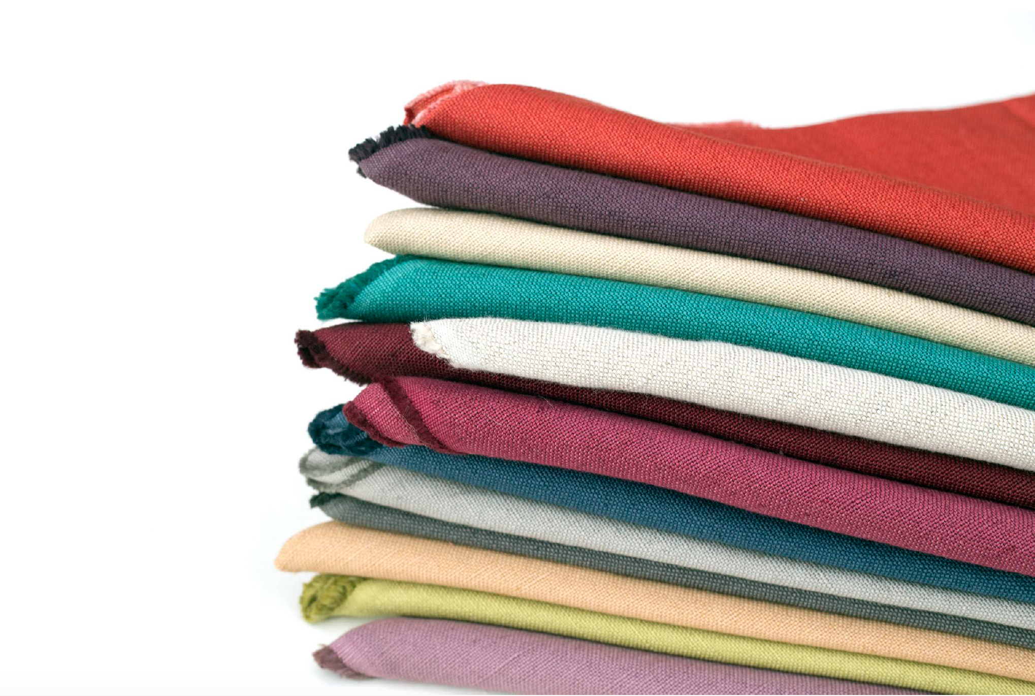
Seema's Pinwheel

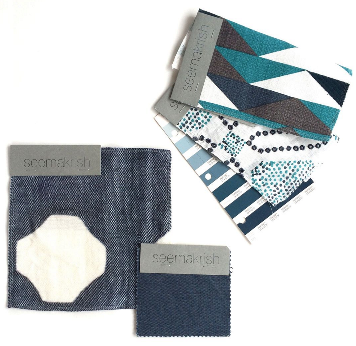
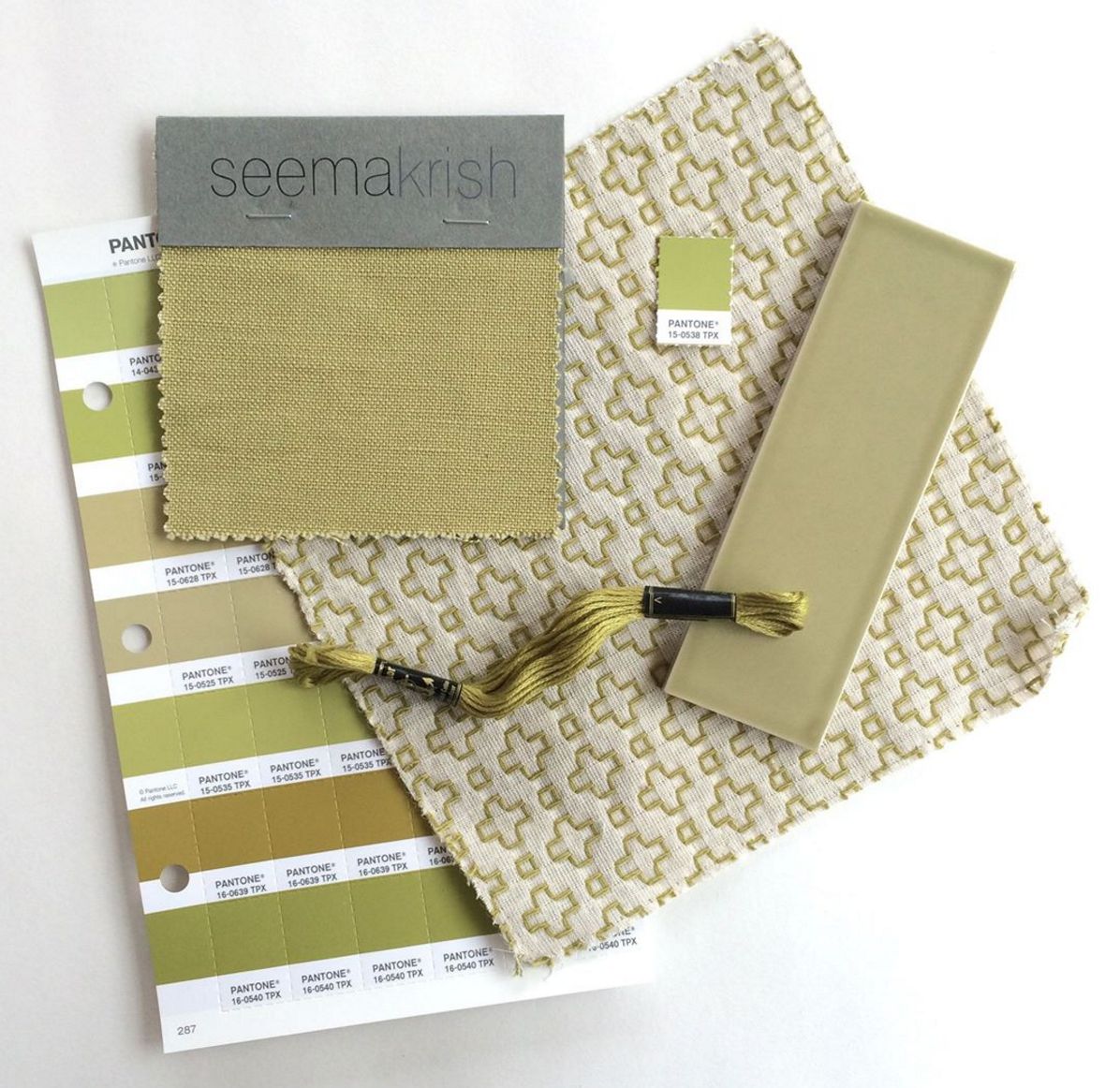
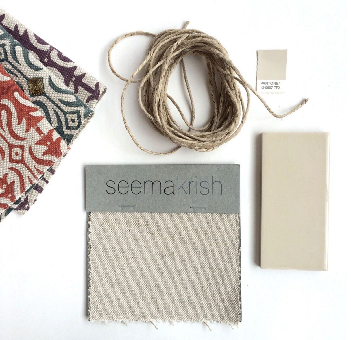
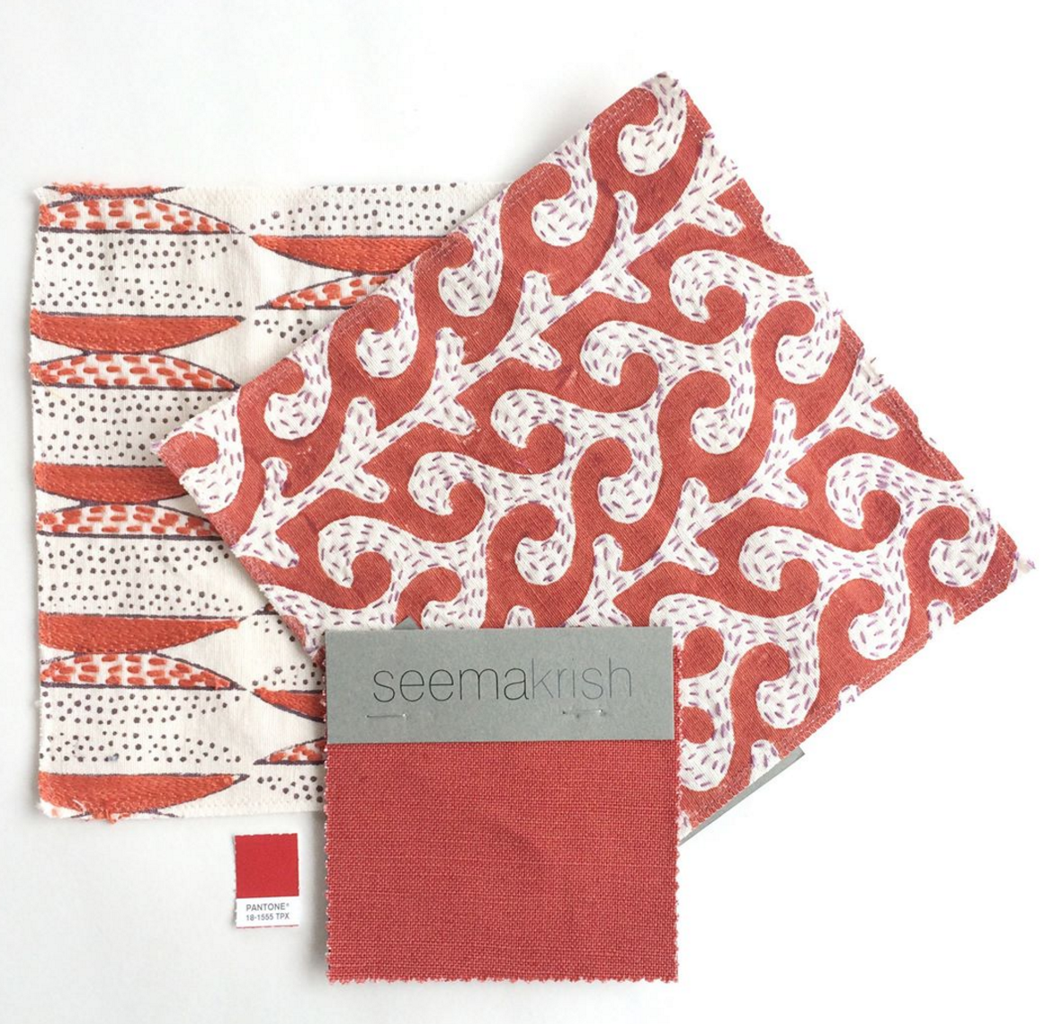
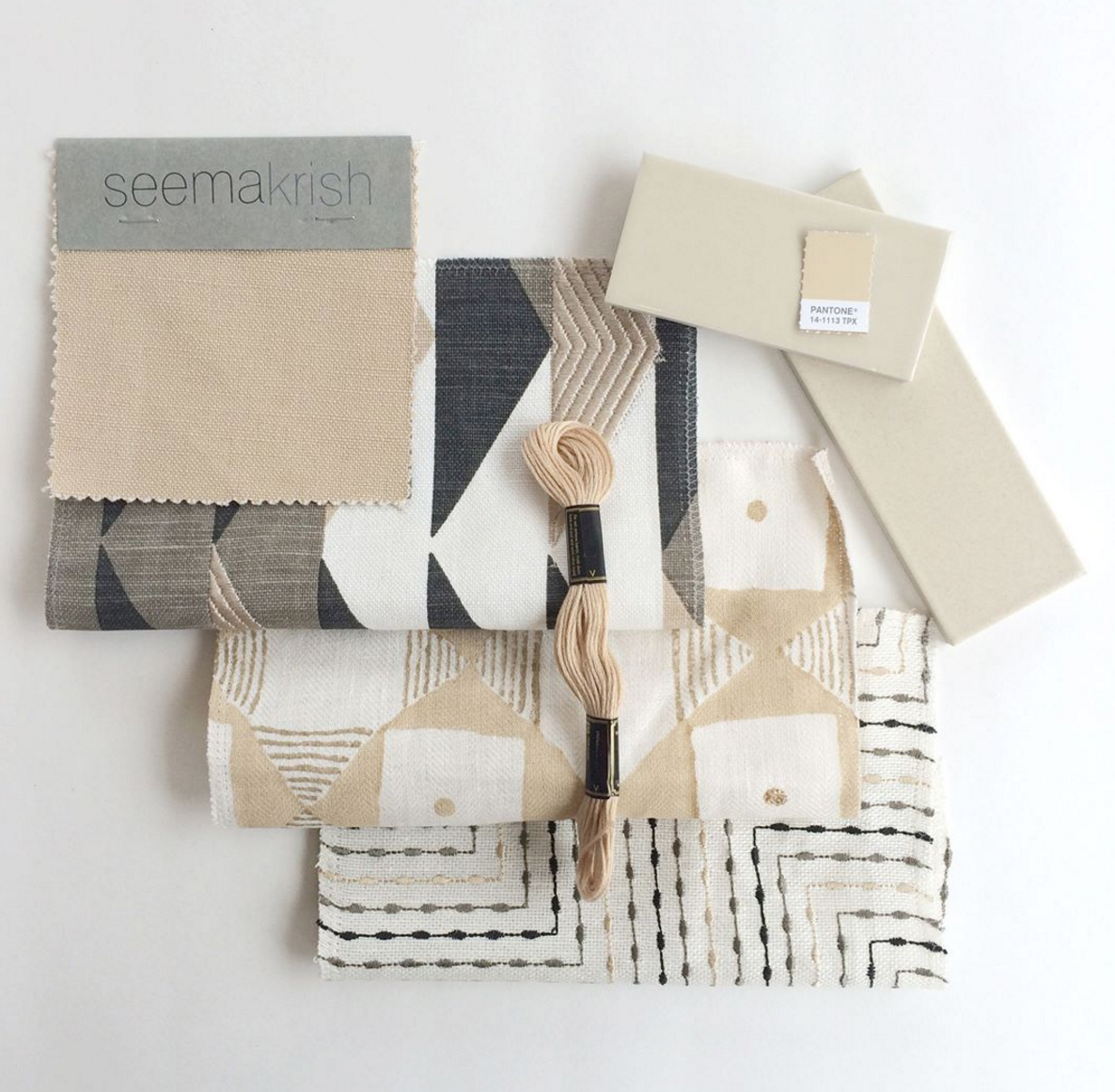
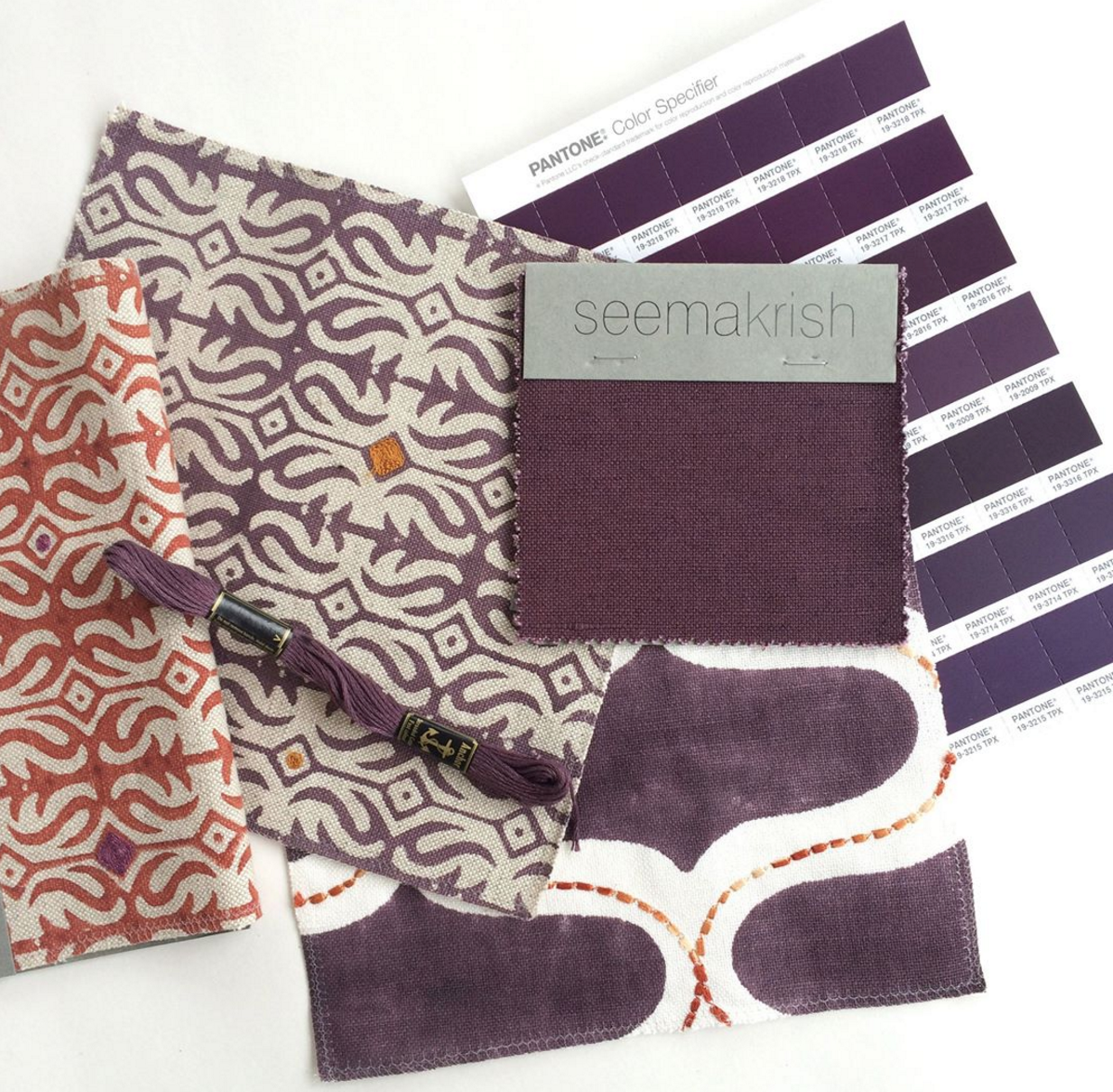
Our friend and talented textile designer, Seema Krish, has just unveiled her new line of solids in the most beautiful hues! The Pinwheel collection of Linen/Cotton blends comes in fourteen colors ranging from Goa Sand to Peacock Blue to Cherry Lane Red, all that perfectly match her vibrant patterns from past collections. 

Get inspired by following along on Seema's Instagram where she is highlighting the 14 colors in action over 14 days. You just might be the lucky winner of their giveaway - a signed edition of Pantone: The 20th Century in Color and a tote bag in one of Seema's signature patterns that we love so much.  

Palette No. 49

Pantone Vignette Featuring Caroline Cecil Textiles

CLOTH & KIND // Pantone Vignette Featuring Caroline Cecil Textiles

What an honor it was to be selected by Pantone as one of a handful of design firms from across the country to create a vignette for their Design Exhibition at Atlanta's AmericasMart, each inspired by one of Pantoneview's Home + Interiors 2016 color palettes. Turns out, the entire process was just darn fun, to boot.

CLOTH & KIND // Pantone Vignette Featuring Caroline Cecil Textiles

We selected Pantone's Soft Focus palette, which spoke to us both at our core, and almost instantly conjured up images in our minds of a beautifully chaotic artist or collector's studio. Soft Focus is a stellar collection of hues that represent a place between pastels and mid-tones. Subtle and/or muted, sometimes described as 'smoky' and pleasingly versatile, they are often married to a variety of other like shades. Whether in striated, layered or veiled patterning where, when used in combinations, one color blends effortlessly into another.

CLOTH & KIND // Pantone Vignette Featuring Caroline Cecil Textiles

We've been fans of Caroline Cecil Textiles ever since we were first introduced to Caroline at the Bradley showroom in Atlanta during Design ADAC week. When we got a sneak peek of her new designs and asked if she'd be interested in including a couple of them (TITIK & HUTAN) in our Pantone vignette and she enthusiastically said yes, we knew the design was taking shape just as we wanted. We couldn't wait to use TITIK all over the walls, in true CLOTH & KIND fashion, as a textural backdrop to for the art, and HUTAN seemed as if it was made for Palecek's Strings Attached chair, no?

CLOTH & KIND // Pantone Vignette Featuring Caroline Cecil Textiles

The AmericasMart showrooms and vendors were all wonderful about allowing us to pull from their inventory to create the space we imagined. Special thanks to Currey & Company for the chandelier, Eliko for the gorgeous vintage kilim rugs, Palecek for that spectacular chair, Go Home for the hide chair and desk, and Golden Oldies for so many of the interesting pieces that made the space look truly layered and patinaed - just the way we like em! Also, a huge shout out to Zoe Bios Creative whose artwork we incorporated. We would have used more had we had the wall space! Much of the art also comes from our CLOTH & KIND vintage collection. 

CLOTH & KIND // Pantone Vignette Featuring Caroline Cecil Textiles

Caroline interviewed us for her blog (which is fabulous, by the way - check it out!) and gives nice insight into our creative process so we wanted to share it with you all here as well.

CCT // Can you ladies share a bit about the conception of your theme and your design process.

CLOTH & KIND // The nice thing about being invited to design vignettes like this one is that it gives us the opportunity for complete and total creative freedom, unlike when we are designing with and for a client and it’s our job to create a space that perfectly suits their personal tastes. We always have a blast letting our minds wander and coming up with ideas that are personally moving to the two of us. For this particular Pantone space, we selected the ‘Soft Focus’ color palette because we were endlessly inspired by the relaxed and creative hues like Tourmaline (Pantone 16-4411), Smoke Green (Pantone 15-6315), Blossom (Pantone 14-1513), Nostalgia Rose (Pantone 17-1512), Cream Gold (Pantone 13-0739) and Peach Nougat (Pantone 14-1220). With such a range of tones, we almost immediately envisioned a colorful artist’s studio with walls covered in vibrant paintings. As with all creative endeavors, when we hit the right concept or idea, both of us are just like ‘YES, this is it!’ and the rest happens organically and very naturally.

CTT // How did you source key materials, including textiles from CCT’s new line?

CLOTH & KIND // In true CLOTH & KIND form, we wanted to swath the walls with a textile to be a stunning and textural backdrop to all of the paintings we envisioned. We had met Caroline Cecil recently at ADAC and admired her work so we inquired if she’d be interested in working with us. When she enthusiastically replied that she was AND she had some new, never been seen before designs that we could use, it was another moment in our creative process where we felt everything coming together just as it should be. We fell in love with her new TITIK and HUTAN patterns and the rest was history. Since HUTAN has a bit of a tropical vibe to it, we played that up further with the Currey & Co light fixture and the Palecek woven chair we selected. Eliko is hands down our favorite source for vintage and antique rugs and we found the colorful Kilims through them. AmericasMart vendors were all so gracious about allowing us to pull from their inventory and use pieces that fit with our project. We’re pretty darn happy with how it all turned out.

CCT // Where did you source the artwork?

CLOTH & KIND // Zoe Bios has an incredible array of gorgeous artwork so we got a couple of large pieces from there, but the rest is vintage from our CLOTH & KIND Atelier collection. We always have to include vintage in projects. It adds a layer of patina that is so key to any space for us.

CCT // Where did you source the chair and what was the process like reinventing it and reupholstering it?

CLOTH & KIND // Isn’t it fabulous? It’s called the Strings Attached chair (which we got a giggle over). Our friends at Palecek are always so incredibly supportive in allowing us to use their inventory for special projects like this one. They were even cool with us reupholstering the cushions in CCT’s Hutan, which felt like it was MADE for this chair.

CCT // Well, it's clear that all the hard work paid off. The vignette was a total stunner, and according to many, the talk of the show. Hey, even Rue Magazine selected it as their favorite vignette! Click here to read their thoughts. If you're interested in HUTAN and TITIK, the two new CCT prints that CLOTH & KIND used in their vignette, stay tuned. We will be unveiling a pre-launch online next week, followed up to the full launch in our showrooms on February 16th. 


Be sure to check out the other gorgeous vignettes created by the talented interior designers that participated in the Pantone Design Exhibition including Janie Hirsch, Heather Hogan Roberts, Shaun Smith, Michael Habachy, Robert Leleux, Jamie Durie, Michel Boyd & Kristin Alber.

Thank you again to all of our creative partners and showrooms. You are the best!

PS // Here's a couple of shots from the Pantone soiree at AmericasMart. As you can see, we didn't have any fun at all! 

CLOTH & KIND // Pantone Vignette Featuring Caroline Cecil Textiles

PHOTO CREDITS // All images taken by CLOTH & KIND

Fab Five: Cabana

1 | 2 | 3 | 4 | 5

Ann Wood

In these gray days of January, a beautiful meadow ushers forth from the studio of artisan Ann Wood.  Ann creates fine, mixed media artwork from paper and wire of flowers and feathers, butterflies  and leaves.

 Her work is extremely delicate.  She manipulates the paper and wire, with drawing and by making very fine cuts with small embroidery scissors.  

Ann then hand sews her creations to wool and velvet backgrounds, framing her compositions in vintage frame stock. 

Ann's exquisitely detailed work is fanciful, yet realistic.  She explains that she is directly inspired by historical botanicals, and long ago craftsmanship.  

When I first saw her art, I was instantly reminded of the glorious botanicals created in the 18th century by Mary Delany:  

Delany also fashioned her flowers from paper using small embroidery scissors. While Delany's depiction of botanical specimens was scientifically accurate down to the precise color, size, leaf,  and stamen, Ann imagines a more dreamlike garden.

How wonderful that we can turn to the artwork of Ann Wood and find a perpetual spring, even in the depth of winter. 

EDITOR // This post was penned by our friend and guest editor Lynn Byrne.

IMAGE CREDITS // All images of Ann Wood's artwork from her website.   Image of Mary Delany's artwork from the book Mrs Delaney, Her life and Her Flowers by Ruth Hayden.

Hue: Rose Quartz & Serenity

CLOTH & KIND // Hue: Rose Quartz & Serenity by Contributing Editor Molly Velte

This Hue post was inspired by Pantone's 2016 Colors of the Year, Rose Quartz & Serenity.

FABRIC // Alex in Blush from Ferrick Mason // Pillow // Mug // Painting // Sofa // Kelly Wearstler Interior

EDITOR CREDIT // This post was developed and written by guest editor Molly Velte

Habitat: The Field Guide to Decorating

Lauren Liess has it going on.  Just seven short years ago, she wrote on her popular blog Pure Style Home that she had just moved into her parents' basement with her husband and (unexpected) baby.  Since that that time, Lauren has become widely recognized as a hot design talent with a rack of press credits to show for it.  She also has designed and launched her own line of textiles.  In addition, Lauren has renovated and and decorated two of her own houses and recently moved to a third, having long said goodbye to that basement.  And, drumroll please, she has recently written a design tome entitled Habitat, The Field Guide to Decorating, our topic today.  Oh yeah, Lauren also had 3 more kids.  I am tired just thinking about it. 

Lauren is one of those designers with her own “look” and we love it.  She imbues all of her interiors with a sense of nature, liberally sprinkling them with greenery and quirky vintage finds.  

Her lovely textiles inspired by wildflowers and other flora often are prominently featured in her designs. 

Everything is deeply comfortable, and pet and family friendly.  In Habitat, Lauren painstakingly takes us through her entire design process, so we learn step-by-step how she accomplishes her rooms.

The book is divided into three sections.  In the first section, Lauren addresses the fundamentals of design such as architecture, color and floor plans.  In the book’s second section, Lauren writes about design’s intangibles, like mood and style.   The third part sets forth the unique considerations for designing the principal rooms in a home in a room-by-room guide.  Hello, perfect kitchen.

Budding decorators will find her advice invaluable.  While Habitat can be read straight through, and makes a gorgeous addition to your coffee table, it also can be used as a reference guide.  For example, Lauren describes a variety of options for choosing each of the primary elements that make up a room, like flooring, furniture, rugs and fabric.  How handy to have a guide all in one place for something like fabric, for instance,  that describes the properties of textiles such as wool, linen and cotton and sets forth their most suitable use.  Lauren even offers a work sheet to help one achieve the mood and style they desire.

Seasoned decorators also will love the book.   Lauren provides a comprehensive and invaluable resource list.  In addition, since Lauren often makes unconventional choices,  the beautiful images of her work are hugely inspirational.   Her way of choosing and hanging art are particularly imaginative.   Indeed, her ideas of what constitutes art are unique.  She has even hung a large branch on the wall with great effect.

Habitat offers something for anyone interested in design.   We can’t wait to see what Lauren will do next.  

IMAGE CREDITS // All photography by Helen Norman.  Thanks to Lauren for providing Lynn with a review copy. 

EDITOR CREDIT // This post was developed and written by guest editor Lynn Byrne.

Happy New Year!

CLOTH & KIND // Happy New Year!

It is with much appreciation, love and respect that we bid adieu to the beautiful year that was 2015 and usher in 2016.

The new year, in its infancy, is already brimming with promise, creativity, inspiration, collaboration, and possibilities, leaving with us a deep sense of gratitude for all that's happened in the last year to get us to the place we are now, and sheer excitement and optimism for what's to come. 

To all of our family, friends, clients, vendors, collaborators and creative partners... we're wishing you and yours a fabulous new year!

Pantone 2016 Colors of the Year Party

We're so very excited to share our Pantone-inspired vignette design with you all, and hope you can join us for this little kickoff shindig on January 15th in Atlanta! Much more to come on this special CLOTH & KIND project, so stay tuned.

In the meantime, do tell us... what do you think of the 2016 colors of the year (the first time Pantone has ever announced two colors, by the way), Rose Quartz & Serenity? Oh, and if it's inspiration in these tranquil hues you're looking for, search no further

Image Credits // Header Image via Pantone's Instagram (Mural by Man One Art); Event Invitation Provided by AmericasMart & Pantone.