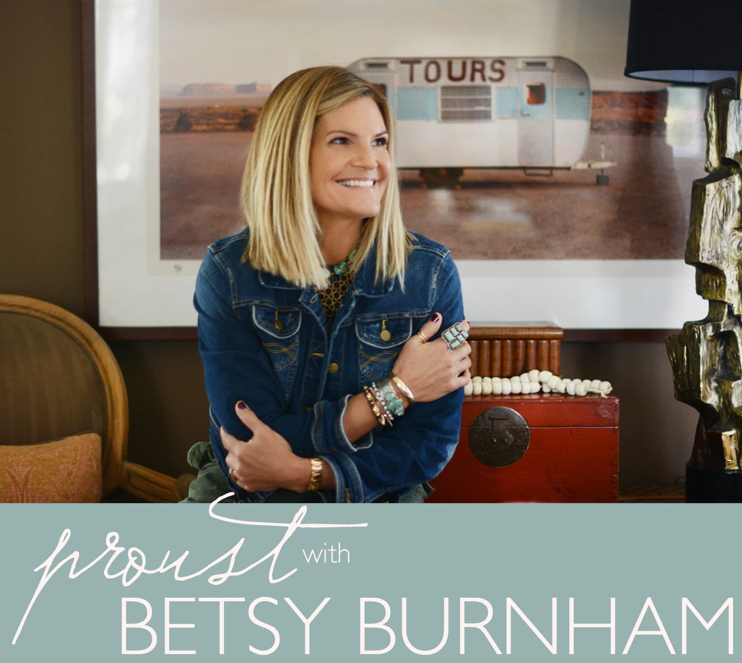
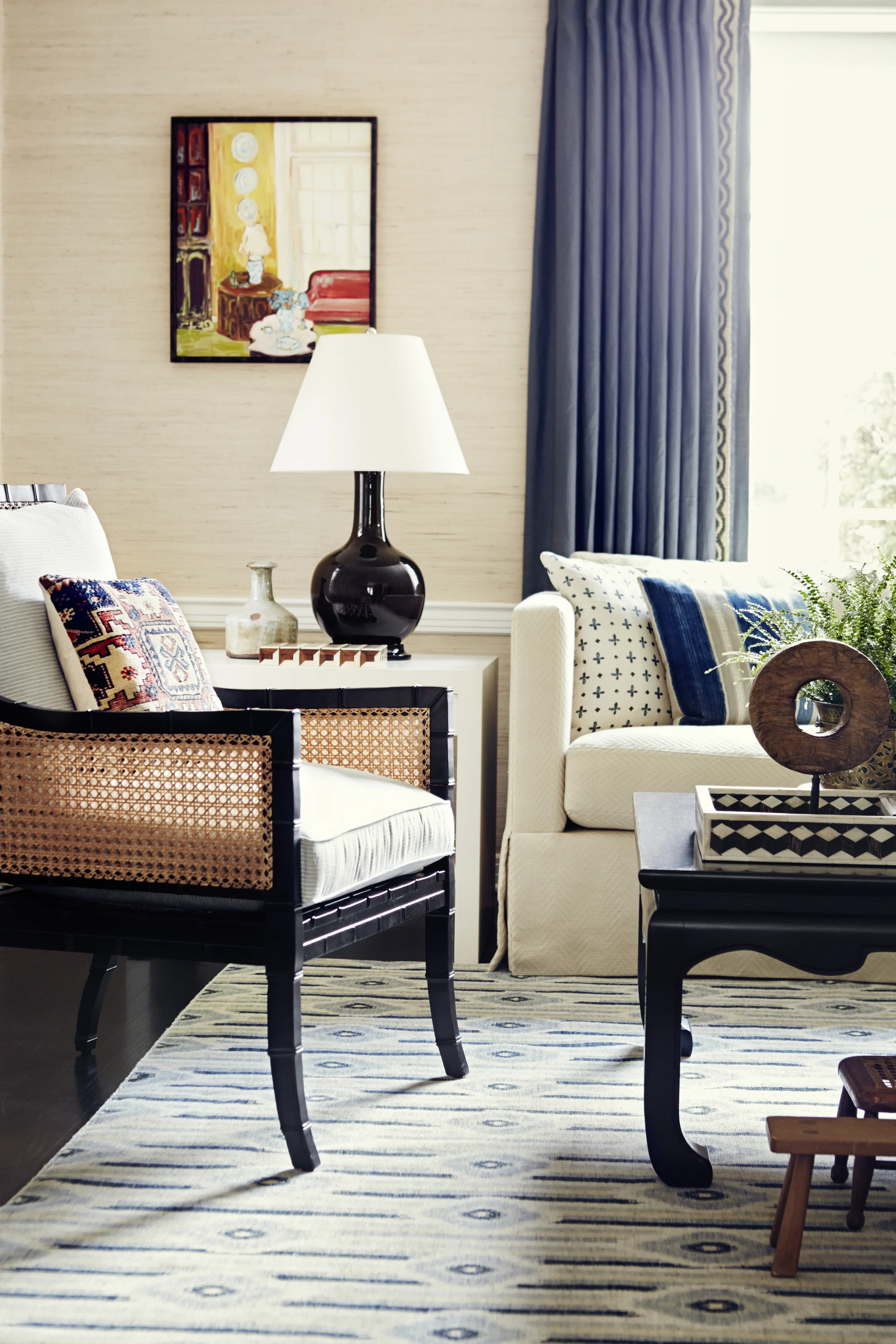
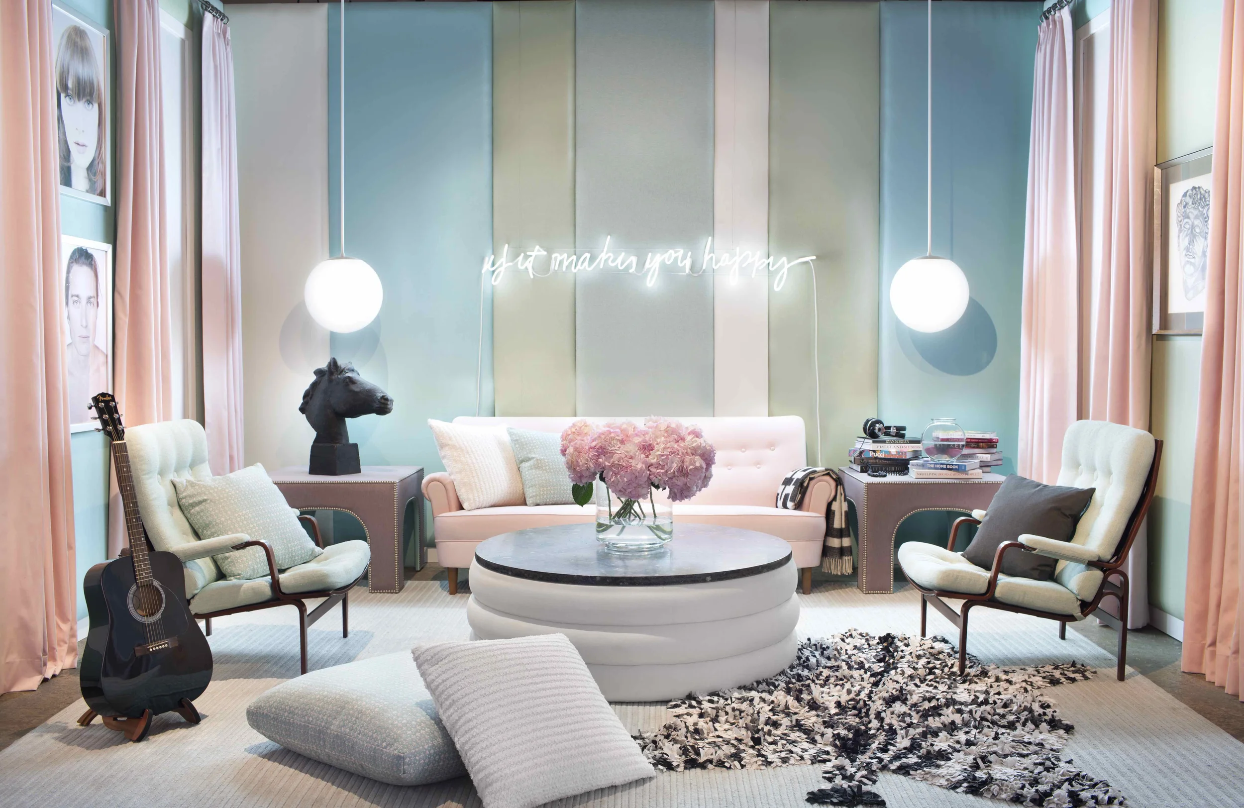
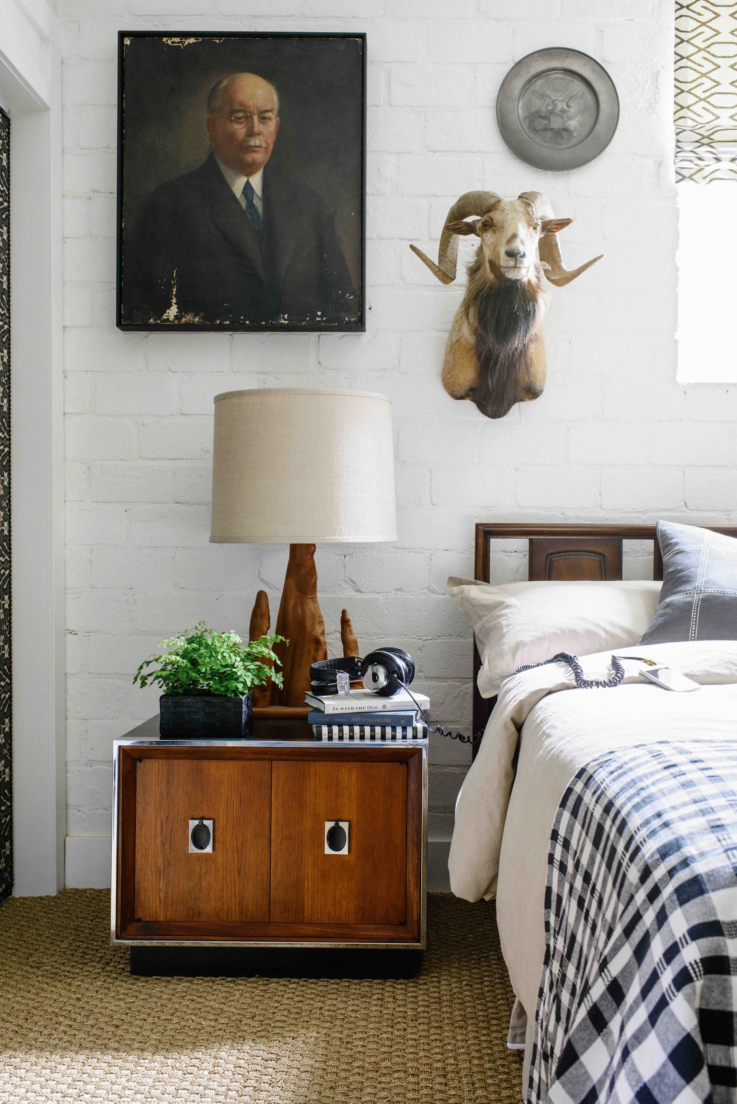
Betsy Burnham

what is your idea of perfect design happiness?
GOOD ARCHITECTURE, GREAT LIGHT, A HEALTHY BUDGET
AND A TRUSTING CLIENT.

what is your greatest fear in design?
TRENDINESS.

which historical design figure do you most identify with?
RALPH LAUREN.

which living designer do you most admire?
TOM SHEERER, JEFFREY BIHUBER,
AND MY DESIGN PARTNER, MAX HUMPHREY.

what profession other than design would you like to attempt?
I’D DEFINITELY BE WORKING IN THE FASHION INDUSTRY.

what is your greatest design extravagance?
BEAUTIFUL BEDDING, TEXTILES AND RUGS.

when and where were you happiest with your design?
I’M HAPPIEST RIGHT NOW! THERE’S SO MUCH GOING ON
AND EVEN MORE TO LOOK FORWARD TO.

what do you consider your greatest achievement in design?
I’M PRETTY PLEASED ABOUT BEING A PIONEER IN THE WORLD OF
WHAT’S COME TO BE KNOWN AS ‘E-DESIGN.’ MY INSTANT/SPACE
CONCEPT WAS THE FIRST OF ITS KIND, AND CONTINUES TO BE A
BUSY SEGMENT OF OUR BUSINESS TO THIS DAY.

if you died and came back as another designer or design object,
who or what do you think it would be?
A PIECE OF CONTEMPORARY ART. I’D CREATE CONVERSATION
AND DEBATE AND HOPEFULLY MAKE A FEW PEOPLE SMILE.

what specific design related talent are you lacking
that you would you most like to have?
I WISH I COULD SEW.

what is your most treasured design related possession?
THE ART I’VE COLLECTED OVER THE YEARS.

what do you regard as the lowest depths of misery in design?
MCMANSIONS.

what curse word do you most frequently use?
WOW.
I DON’T REALLY CURSE THAT MUCH.

what is your favorite design related word?
CRISPY.

what is your least favorite design related word?
TRANSITIONAL.
IT’S THIS MADE UP WORD AND I DON’T GET IT.

what turns you on in design?
VINTAGE PIECES MIXED WITH MODERN ONES.
BOOKS ON BOOKSHELVES.

what turns you off in design?
WHEN PROFESSIONALS SAY ‘HEIGHTH’ INSTEAD OF ‘HEIGHT’,
AND ‘NITCH’ INSTEAD OF ‘NICHE.’
I ALSO CAN’T STAND CHENILLE.

what is your motto in design?
GOOD. FAST. CHEAP. PICK TWO.

//

IMAGE CREDITS // Images provided by Betsy Burnham.

ABOUT PROUST ON DESIGN // Answered by our design icons, these must-ask questions come from a 19th century parlor game made popular by Marcel Proust, the French novelist, essayist & critic. Proust believed the direct questions and honest responses that they elicited revealed the true nature of the individual. For this column, we have put a design related spin on the traditional questions. While this method has been used by many journalists throughout the years, we were primarily inspired by The Proust Questionnaire, which appears monthly on the back page of one of our all time favorite magazines, Vanity Fair (also Krista’s alma mater). Read all of the previous Proust on Design questionnaires here.  

Brian Paquette Textiles

We're grooving on our friend Brian Paquette's new European inspired textile line. He just recently introduced three bold geometric patterns - Brussels, Saint MaloEdinburgh - and each one comes to life with a sophisticated yet unpretentious air in their muted hues of gray, black and white. 

Brian tells us about his inspiration behind each design...

BRUSSELS (Above) // ' Geometric and solid, these angles embrace. Set between sprawling Paris and intimate Amsterdam, the eclectic home of Magritte captured my attention. The city's proud art and architecture impresses. A similar pattern appeared prominently in the King of the Belgians' museum-like home.' 

SAINT MALO (Above) // 'Woven and light, these lines are delicate. En route to Normandy we stopped in this seaside city encircled by mighty stone walls. Having rushed to the top of its breezy ramparts to witness the setting of the sun before dinner, floors in the tiny restaurant we happened upon inspired this pattern.'

EDINBURGH (Above) // 'Ordered and bright, these diamonds glisten. Following a hike up the damp green peak of Arthur's Seat, a visit to the Queen's storied Palace of Holyroodhouse revealed the unexpected parquet that inspired this pattern. I've never felt more at home abroad than in this enchanting city.' - Brian Paquette

For more information, or to purchase yardage, contact Brian Paquette Interiors directly. You'll find these and many other gorgeous textiles for the home that have been curated by CLOTH & KIND in our Textile Files on Pinterest

Tracey Tubb's Origami Wallpaper

Tracey Tubb's origami wallpaper stopped me in my tracks as I rounded the aisles at last fall's Tent London, during the London Design Festival.  A graduate of Britain's Royal College of Art, Tracey is a perfectionist.  She designs and creates her origami wallpaper in single strips that she folds by hand  "with meticulous attention to detail that borders on obsession." 

Tracey's wallpaper is available as single drops to be used as art, or as a whole wall installation. She welcomes bespoke commissions.   

To view more wallpaper - like Tracey's - that's loved by Krista & Tami of CLOTH & KIND, check out their curated Textile Files on Pinterest, especially the Wallpaper board

IMAGE CREDITS //  Photo of framed wall panel and header  by Lynn Byrne.   Other images and quote from Tracey Tubb's website.

EDITOR CREDIT // This post was developed and written by guest editor Lynn Byrne.

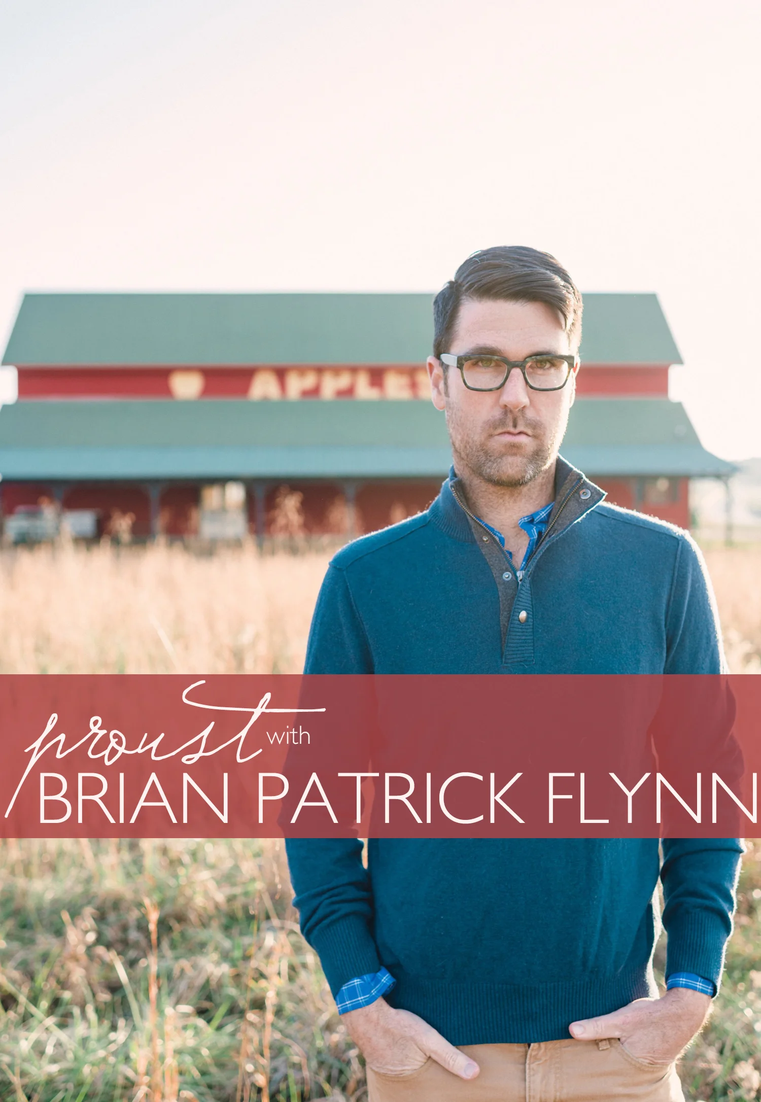
Brian Patrick Flynn

what is your idea of perfect design happiness?
DOING WHATEVER YOU WANNA DO TO YOUR HOME AS LONG AS IT MAKES YOU HAPPY, ACKNOWLEDGES THE ARCHITECTURE AND/OR HISTORY OF THE HOUSE OR BUILDING, ABIDES BY THE BASIC PRINCIPLES OF DESIGN, AND MAKES YOU EXCITED TO COME HOME.

what is your greatest fear in design?
I’M TERRIFIED OF CREATING SPACES THAT ARE CONSIDERED ‘SAFE’ OR ‘TEXTBOOK’; IT’S JUST NOT PART OF MY CONSTITUTION, AND I’D RATHER SELL SLANKETS, SNUGGIES OR SELFIE STICKS FROM A CALL CENTER THAN STICK TO THE STATUS QUO. 

which historical design figure do you most identify with?
THOMAS O'BRIEN.
ALTHOUGH HE'S YOUNG AND STILL KICKING IT BIG-TIME AND THEREFORE NOT NECESSARILY 'HISTORICAL' PER SE, HE'S AN ICON. I LOVE HIS MIX OF CLASSIC AND INDUSTRIAL PIECES AS WELL AS HIS SOMEWHAT CASUAL YET ELEGANT APPROACH TO LIVING. EVERYTHING HE DOES LOOKS COLLECTED AND WELL-CRAFTED AND THERE'S ALWAYS A MASCULINE VIBE AND THAT'S TOTALLY WHAT I'M DRAWN TO.

what turns you on in design?
RISK.

what turns you off in design?
MATCHING.

what is your greatest design extravagance?
ART.
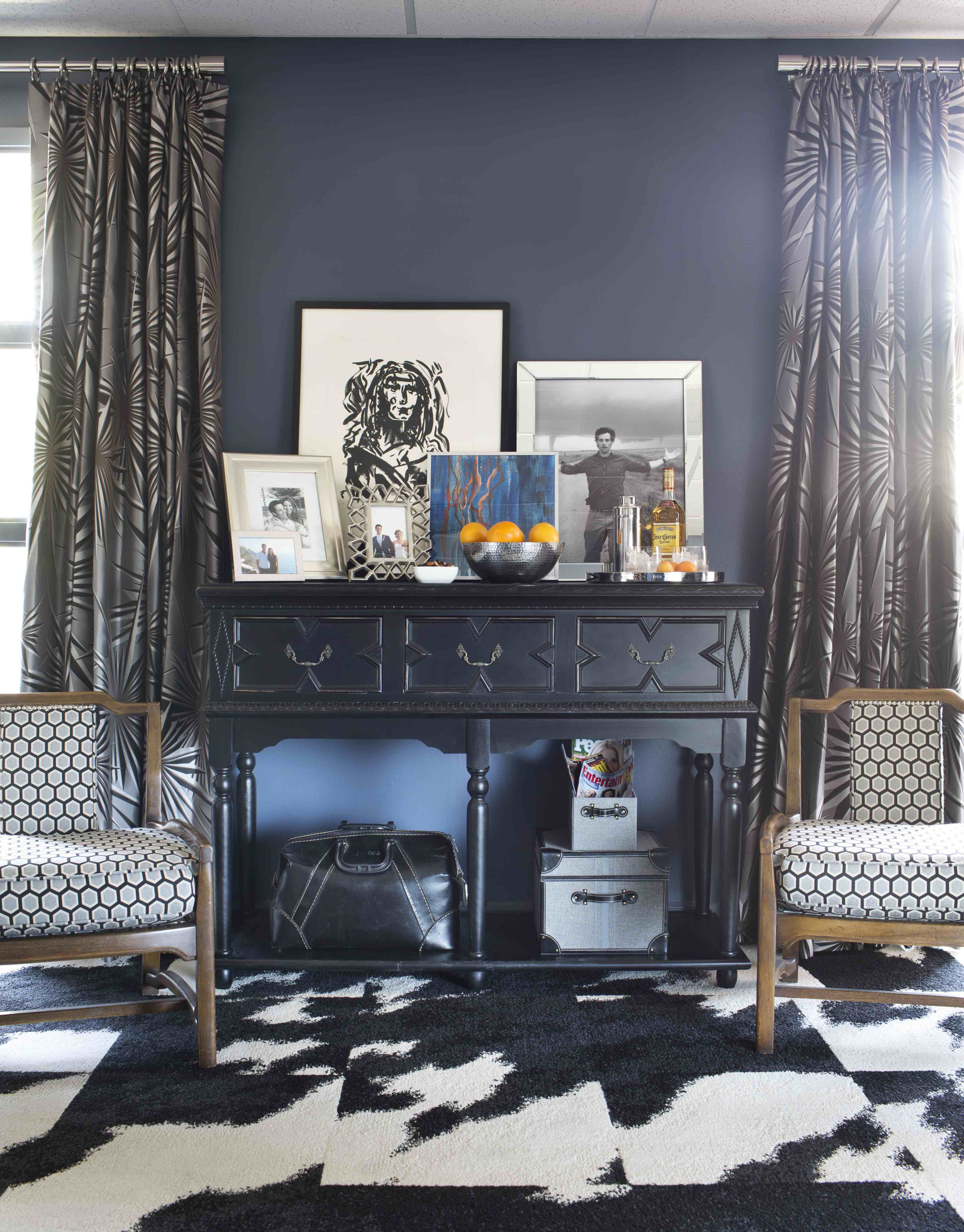
REGARDLESS OF BUDGETS BIG OR SMALL, I’M ALWAYS A SUCKER FOR SPENDING ON GOOD ART. WHEN BUDGETS ARE TIGHT, I’LL BUY STUDENT WORKS, INVEST IN HAVING THEM PROFESSIONALLY FRAMED, THEN PAIR THEM WITH BARGAIN FURNITURE FINDS FROM IKEA AND/OR FLEA MARKETS. I THINK GOOD ART ELEVATES THE TASTE LEVEL OF EVERYTHING AROUND IT, AND IT’S AN AMAZING VALUE ENGINEERING TOOL.

which living designer do you most admire?
THREE-WAY TIE: BETSY BURNHAM, MATTHEW QUINN AND JOE LUCAS.
BETSY BURNHAM’S MAGICAL ABILITY TO CREATE PREPPY-ISH, CLASSIC AND EDGY SPACES THAT ARE BOTH CASUAL AND COMFORTABLE BLOWS MY MIND. MATTHEW QUINN’S KITCHENS AND BATHROOMS, I MEAN, THERE’S JUST NO WAY TO DESCRIBE THEM OTHER THAN SAYING MATTHEW’S IN A LEAGUE OF HIS OWN. JOE LUCAS HAS MASTERED THE TRANSITIONAL AESTHETIC, SO MUCH SO THAT I FREQUENTLY STALK HIS WEBSITE TO SEE IF HE'S POSTED ANY NEW PROJECTS.

what profession other than design would you like to attempt?
ICELANDIC AND GREENLANDIC OFFROADING TOUR GUIDE. PRETTY SPECIFIC, RIGHT? YEAH, I KNOW. I'M ABSOLUTELY OBSESSED WITH ICELAND AND GREENLAND AND LANDSCAPES THAT LOOK LIKE MARS KINDA. IN A PERFECT WORLD, I WOULD HAVE AN AMAZING ATTIC APARTMENT IN REYKJAVIK AND SPEND SEPTEMBER THROUGH DECEMBER TAKING PEOPLE OUT TO SEE THINGS THAT ARE OTHERWORLDLY.

when and where were you happiest with your design?
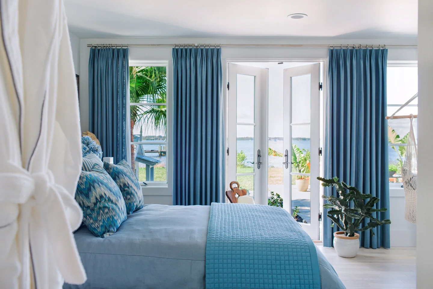
HGTV DREAM HOME 2016 IN MERRITT ISLAND, FLORIDA.
IT'S A 3300-SQUARE-FOOT LUXURY HOME ON THE WATER AND I REALLY REINVENTED WHAT FLORIDIAN STYLE MEANS TO ME. THIS IS PROBABLY THE LARGEST PROJECT I'VE EVEN DESIGNED AND I'M REALLY PROUD OF HOW IT'S TURNED OUT. IN FACT, THE ENTIRE HOUSE GOES LIVE ON HGTV.COM THIS WEEK. MY FAVORITE ROOM OF ALL IS THE TERRACE LEVEL BEDROOM WHICH IS SIMPLE AND COVERED IN WHITE WITH SPLASHES OF FRENCH BLUE THAT PICK UP IN THE SICK VIEW OUTSIDE THE WINDOW.

what do you regard as the lowest depths of misery in design?
NOT HAVING ANY TASTE WHATSOEVER, GOOD OR BAD.
A LITTLE BAD TASTE CAN BE AWESOME AND THOUGHT-PROVOKING, JUST LIKE GREAT TASTE CAN BE INSPIRING AND MAGNIFICENT. BUT JUST NOT CARING WHAT YOUR HOME SAYS ABOUT YOU AT ALL, THAT I CAN’T GET MY HEAD AROUND. I SAY THIS AS I SIT IN MY OFFICE IN PAJAMAS, SPORTING A T-SHIRT STAINED WITH ICE CREAM AND WEARING A SOCK ON ONLY ONE FOOT…SO CONSIDERING THE SOURCE HERE IS KEY.

what is your favorite design related word?
TIE! PERPENDICULAR AND MONOCHROMATIC.

what is your least favorite design related word?
SWIRLY.

what do you consider your greatest achievement in design?
I’M REALLY PROUD OF MY RANGE.
I HAVE THIS OBSESSION WITH NEVER BEING A ONE-TRICK PONY AND THRIVE ON HAVING CLIENTS WITH COMPLETELY DIFFERENT STYLES SO I CAN CONSTANTLY FINE-TUNE MY AESTHETIC. AS A DESIGNER, I'M INHERENTLY MASCULINE AND PREPPY AND FAVOR DARK COLORS, BUT I'VE DONE TONS OF TRADITIONAL FEMININE SPACES, ENTIRE HOMES VOID OF COLOR, COTTAGES COVERED IN PASTELS, BACHELOR PADS PACKED WITH HIGH-ENERGY HUES, WHITE-ON-WHITE ROOMS AND EVEN CLASSIC COUNTRY HOMES.

if you died and came back as another designer or design object,
who or what do you think it would be?
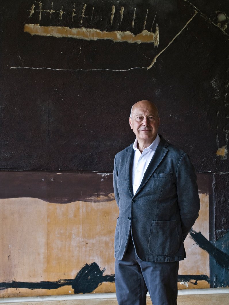
AXEL VERVOORDT (ABOVE).
I WANT TO COME BACK AND DO NOTHING BUT DESIGN AND DECORATE CASTLES IN A MANNER THAT’S TOTALLY CASUAL, COMFY AND UN-CASTLE-ISH.

what specific design related talent are you lacking
that you would you most like to have?
SIMPLICITY.
I’M JUST NOT GOOD AT IT. I LIKE SO MANY THINGS THAT I FIND THE ART OF EDITING TOUGH ENOUGH, LET ALONE SCALING BACK SO MUCH THAT THERE ARE ONLY A HANDFUL OF OBJECTS IN A ROOM. I REALLY WANT TO LEARN TO EDIT MORE, LIKE BETH WEBB, BRIAN PAQUETTE OR KAY DOUGLASS.

what is your most treasured design related possession?
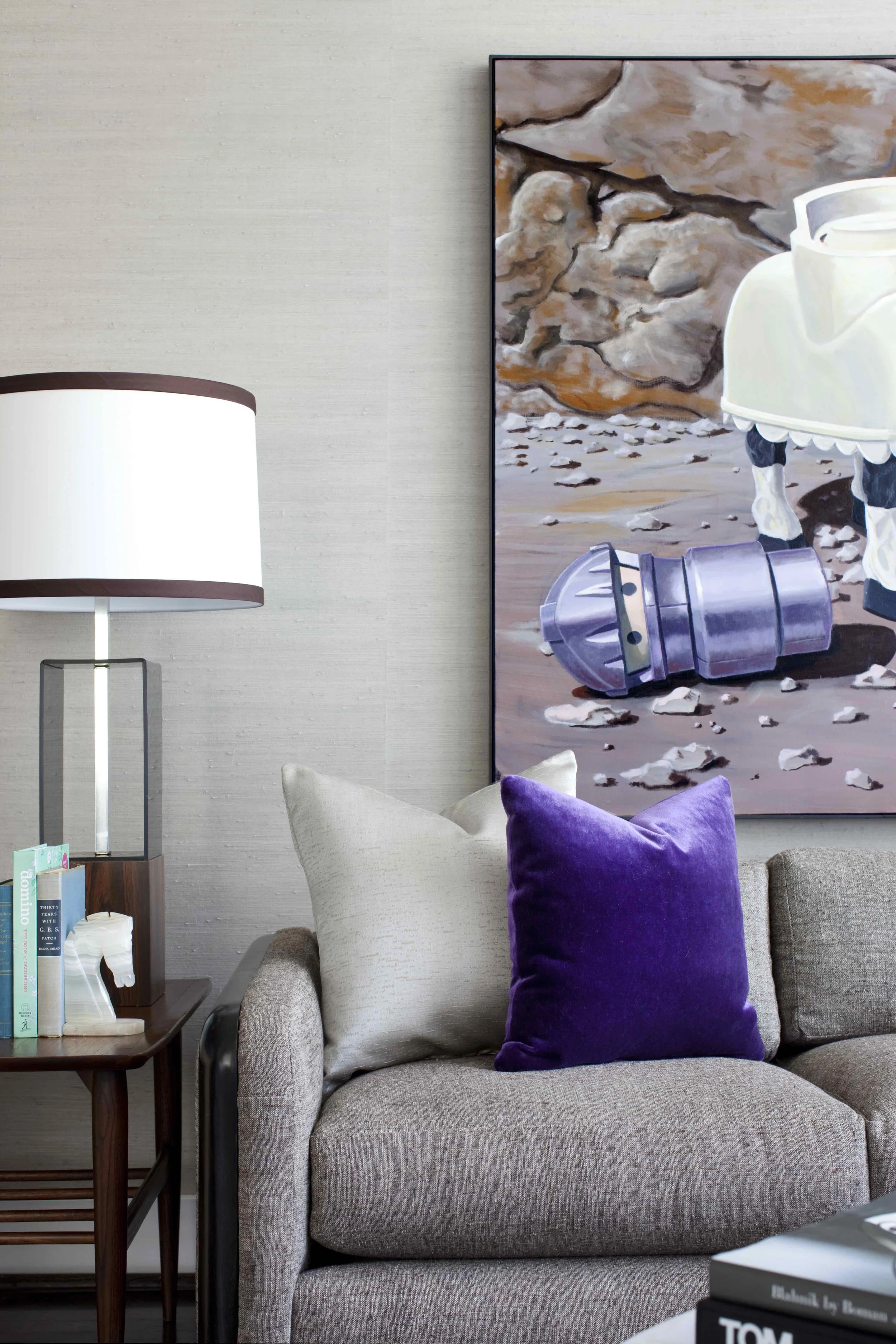
A POP ART PAINTING OF FISHER PRICE LITTLE PEOPLE BY ARTIST JONATHAN FENSKE (ABOVE). IT’S CALLED ‘CHIVALRY IS DEAD’ AND IT’S A LITTLE PLASTIC KNIGHT IN SHINING ARMOR RIDING ON HIS LITTLE PLASTIC HORSE AND IT JUST MAKES ME SO HAPPY WHICH IS TOTALLY MESSED UP BECAUSE IT’S SUPPOSED TO BE KINDA SAD. WTF?

what curse word do you most frequently use?
BELIEVE IT OR NOT THE CURSE WORD I USE MOST IS NOT EVEN A CURSE WORD PER SE, BUT JUST A WORD THAT SOMETIMES SOUNDS CURSE-Y: 'BALLZ'. THE PLURAL OF BALL BUT WITH A HARD Z INSTEAD OF AN S. TRY IT LIKE AFTER YOU STUB YOUR TOE OR SOMETHING; IT TOTALLY WORKS.

what is your motto in design?
ROSES ARE RED. VIOLETS ARE BLUE...
AND THEREFORE THERE IS NO REASON FOR YOUR HOME TO BE BEIGE.

//

IMAGE CREDITS // Images provided by Brian Patrick Flynn except for the photo of Axel Vervoordt which is via Alto Magazine.

ABOUT PROUST ON DESIGN //  Answered by our design icons, these must-ask questions come from a 19th century parlor game made popular by Marcel Proust, the French novelist, essayist & critic. Proust believed the direct questions and honest responses that they elicited revealed the true nature of the individual. For this column, we have put a design related spin on the traditional questions. While this method has been used by many journalists throughout the years, we were primarily inspired by The Proust Questionnaire, which appears monthly on the back page of one of our all time favorite magazines, Vanity Fair (also Krista’s alma mater). Read all of the previous Proust on Design questionnaires here.  
 

Fab Five: Scandinavian Love

CLOTH & KIND // Fab Five: Scandinavian Love by Contributing Editor, Molly Velte

1 | 2 | 3 | 4 | 5

EDITOR CREDIT // This post was developed and written by guest editor Molly Velte.

Flora Crockett

CLOTH & KIND // Curated, Introducing Must-Know Artist Flora Crockett

That last name sounds familiar.  We associate it with a man who had an adventurous and independent spirit: Davy Crockett.  Turns out that Davy's trailblazing qualities have traveled the generations and were imbued in his ancestor, artist Flora Crockett.

CLOTH & KIND // Curated, Introducing Must-Know Artist Flora Crockett

Never heard of Flora Crockett?   Well it's time you did.  The paintings by this forgotten artist were recently lauded by leading art critic, Roberta Smith, for the  New York Times as " a body of work that could hold its own in the collections of the Whitney Museum of American Art or the Museum of Modern Art and in the history of abstract painting." Roberta's "first sighting" of this extraordinary work took place at  an exhibition mounted by Meredith Ward at her New York City gallery.  The very day Roberta published her discovery, I hurried uptown to see the works for myself. 

CLOTH & KIND // Curated, Introducing Must-Know Artist Flora Crockett

My first hand view did not disappoint.  Crockett's paintings are sparkling.  Her color sense  is joyous.  Hues of complimentary colors of orange and blue, red and mint green, yellow and lavender are brushed on loosely in biomorphic and  geometric shapes.  

CLOTH & KIND // Curated, Introducing Must-Know Artist Flora Crockett

In later works, Crockett further defines shapes, and speaks to negative space, by delineating her canvases with bright, tangled lines.

CLOTH & KIND // Curated, Introducing Must-Know Artist Flora Crockett

Crockett paints with a knowing hand.  One can see the influence of famous artists like Leger, Miro, and Kandinsky. But Crockett has a signature, crisp, beaming color palette and her free-flowing compositions are unique.  Take a look at this painting by Crockett on the left and  Kandinsky on the right to compare:

CLOTH & KIND // Curated, Introducing Must-Know Artist Flora Crockett

Crockett's artwork also reflects the time that it was painted.  This body of work was completed between 1965 to 1973 when Crockett was in her seventies.  It was just after the Color Field paintings of artists such as Rothko and Frankenthaler re-invigorated the use of color by making it the point of their work. This painting by Crockett in particular recalls the blocks of color employed by those artists.

CLOTH & KIND // Curated, Introducing Must-Know Artist Flora Crockett

By now, you are likely wondering why you never heard of Flora Crockett before.  It is a classic tale of a struggling artist working hard to support herself while trying to save money so she could take time off to paint.  Sadly the pressures of putting food on the table seemed to impinge on Crockett's artistic creation.  A graduate of Oberlin College with a major in art and mathematics,   Crockett was employed in the fields of art education, design, sales and engineering during her life.  This left time for only 3 solo art shows in her lifetime, the last one in 1946.  
Yet her efforts to further her own art education show that her art remained very important to her.  In 1918, she married an Italian sculptor and, in 1924, they moved to Paris.  There, Crockett found work directing a school for orphans.  Somehow she also was able to continue her education at the Sorbonne, the Louvre and Leger's  Acadamie Moderne, where she eventually became the director.  

After her marriage failed, she returned to New York in 1937, and in 1940, she rented an apartment on 14th street. She lived and painted there for the rest of her life, holding down a variety of jobs to make ends meet. Her last art show was a group exhibition in New York's Overseas Press Club of America in 1965 when Crockett was 73.  Interestingly, all of the paintings so celebrated by the New York Times  (and seen in this post), were painted after that show. 

CLOTH & KIND // Curated, Introducing Must-Know Artist Flora Crockett

What sparked this late-in-life creative explosion?  Meredith Ward explained to me that by the time Crockett reached her seventies, she was able to retire and finally could devote her days to her passion, ushering in her most productive artistic period.  Flora Crockett painted solely for her own pleasure, in her little 14th street apartment, which, in part, explains the paintings' modest size (most are only 24" wide).  According to Meredith, at this stage Crockett would not even let her family see her work, turning canvases around to face the wall whenever someone came to the apartment.  It's fascinating.  Given the freedom of leisure, Crockett's creative genius finally and exuberantly burst forth.  And, with the confidence of age,  she kept it all to herself, not needing the affirmation of others.

CLOTH & KIND // Curated, Introducing Must-Know Artist Flora Crockett

After Crockett's death in 1979, her nephew, Austin Hart Emery, inherited her paintings.  He stored them in a barn in Albany.  Meredith Ward told me she heard of the works through a friend, who then introduced Meredith to Emery's daughter Mary Emery Lacoursiere, an artist and designer living in Nantucket.  

When Meredith Ward saw photographs of the paintings, she was immediately intrigued by this forgotten artist and began the process of cleaning the paintings and mounting the current exhibition.  She hinted that there may be more works by Crockett still in storage. How fabulous.  

CLOTH & KIND // Curated, Introducing Must-Know Artist Flora Crockett

Will the Whitney or MOMA heed Roberta Smith's advice and purchase a Flora Crockett? I hope so.  It would be sad if these dynamic and happy paintings were hidden away in private collections.  The world should finally be able to appreciate the art of Flora Crockett.

CLOTH & KIND // Curated, Introducing Must-Know Artist Flora Crockett

PHOTO CREDITS // Except for the painting by Kandinsky from Bloomberg.com, and the image of Flora Crockett from Meredith Ward, all images of paintings by Flora Crockett are by Lynn Byrne.

EDITOR CREDIT // This post was developed and written by guest editor Lynn Byrne.

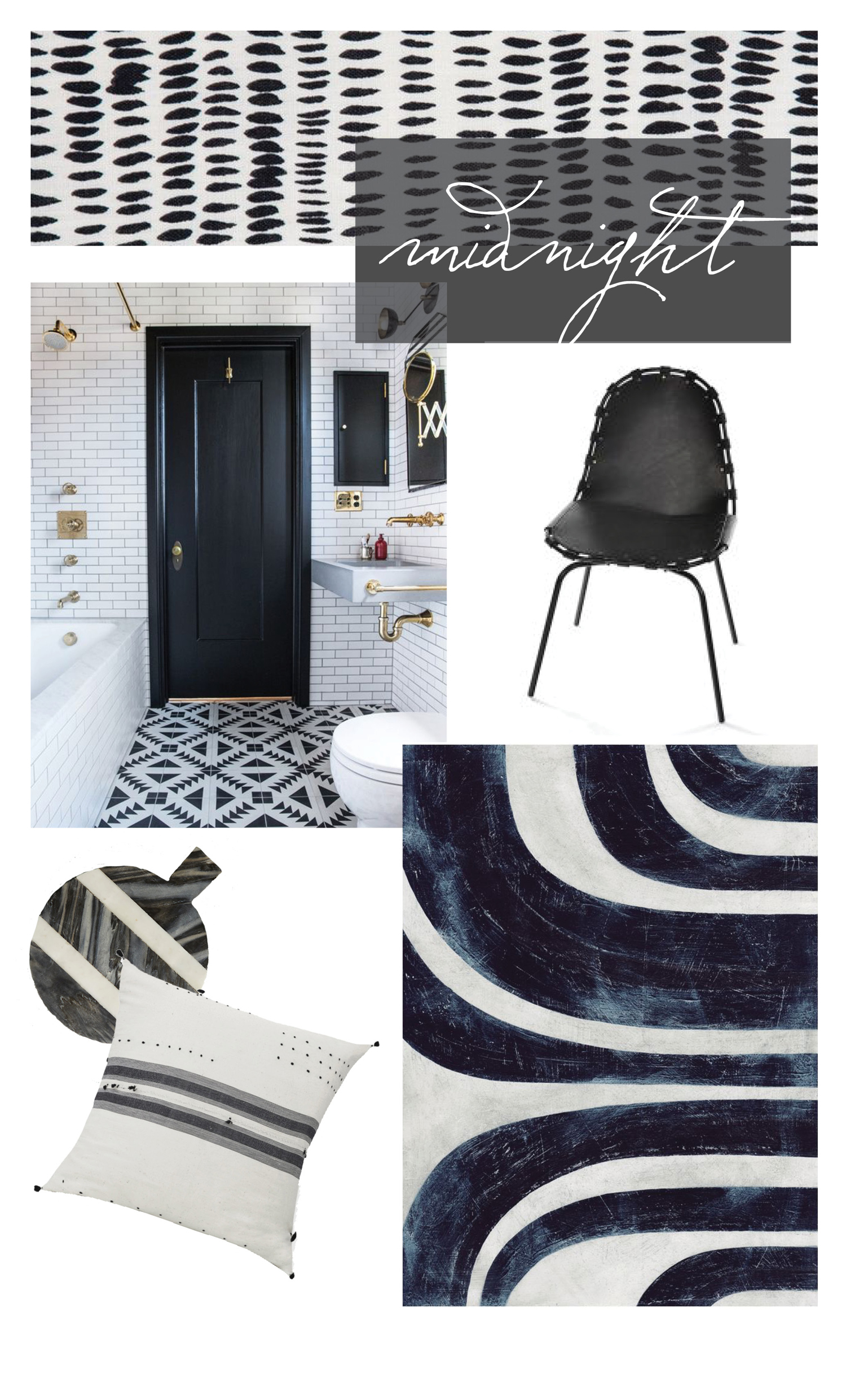
No. 48

Palette No. 47

Hue: Midnight

FABRIC // Dashes in Midnight from Rebecca Atwood // Chair // Art // Pillow // Cutting board // Interior

EDITOR CREDIT // This post was developed and written by guest editor Molly Velte

Provenance: Nottingham Lace and Madras

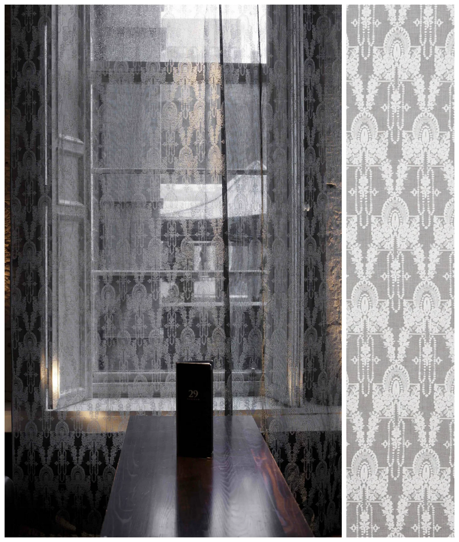
Who hasn't been seduced by the image of lace, moving softly in the breeze, with the sun streaming through leaving an intriguing pattern on the floor.  Or perhaps a tuft of lace at the neckline of a beautiful woman.  So romantic.  Kind of feels a bit like Downton Abbey or a Ralph Lauren ad, don't you think?

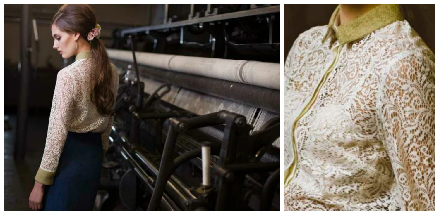
Well, as it turns out, there is only one remaining mill in the world that continues to make true Nottingham lace (and its cousin, madras) - and it is, natch, the lace that you see on Downton Abbey and couture fashion from brands like Ralph Lauren, and Scottish designer Elizabeth Martin whose designs are shown above.  

Who is keeping this legacy alive? The firm Morton, Young and Borland Textiles, based in Ayrshire, Scotland about 25 miles from Glasgow. 

And what's so unique about MYB Textiles' lace? Two things, and both are irreplaceable.  First it is the looms that their product is woven on.  Nottingham refers to the place where the  machine and technology for making the lace first developed, not the lace itself, and MYB Textiles' looms are over 100 years old.  No other firm has them. 

MYB has carefully maintained their original looms from the company's inception in the early 1900s and acquired additional ones as other companies have gone out of business.  These special looms allow MYB Textiles to create wide width fabrics, with highly ornate patterns or, if need be, simple gauze-like textiles. 

But don't assume that MYB Textiles is lodged firmly in the past.  Rather it is the firm's unique ability to adopt modern technology while respecting it's heritage that has allowed the company to survive and thrive.  

And that brings us to MYB Textiles' second unique feature.  Unlike other companies that produced these textiles,  MYB has installed a carefully orchestrated apprenticeship program to allow skills to be passed down from generation to generation.  Plus, a look at the company's Tumblr account also reveals that they regularly take interns from Britain's designs schools, opening themselves up to fresh new ideas from young designers. 

An example of  MYB Textiles' ability to marry old and new goes to the heart of their business.  They have a vast archive of historic designs that they often draw upon for inspiration.  Yet, those designs are now developed with computer assistance.  The company has found a way to harness it's 100 year old looms with electronic jacquards allowing the use of CAD.  

CLOTH & KIND // Provenance: Nottingham Lace and Madras by Contributing Editor, Lynn Byrne of Decor Arts Now

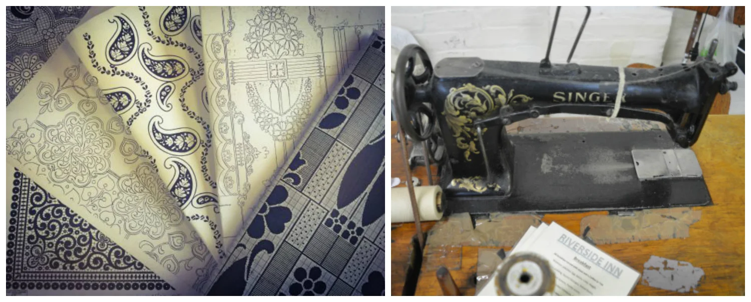
 Margo Graham, one of just two Nottingham lace designers still in existence (her one-time apprentice, Kashka Lennon is the other) explains, "Designing used to be watercolors on draft paper (seen below, left)  but now it's computer-aided. The techniques are still the same but all the skills have been transferred. All the cutting and pasting had to be done by hand in the past, now it's a lot easier."

Even with the advent of modern technology, however, there is still much done by hand. Those 100 year old looms are quirky.  They run slowly and require careful monitoring.  

CLOTH & KIND // Provenance: Nottingham Lace and Madras by Contributing Editor, Lynn Byrne of Decor Arts Now

Once the fabric is loomed, it is taken straight to the darning room to be checked for imperfections.  A hand darner will "invisibly" correct any error, be it by adding missed stitches to the pattern or by removing an extra stitch, known as seeding. Not surprisingly,  it takes many years to become a good hand darner.

So what's the difference between madras and lace?  With madras, below left, the pattern is woven onto a gauze background, so that only the pattern, not the ground, needs to be designed.  Lace (below right), on the other hand, requires that both the background and the pattern be designed. 

Modern technology or not, its obvious that the lace and madras produced MYB Textiles are imbued with romance from the outset. 

EDITOR CREDIT // This post was developed and written by guest editor Lynn Byrne.

IMAGE CREDITS // All lace shown is produced by Morton, Young and Borland Textiles. Quote from Margo Graham taken from an article published in Homes and Antiques magazine in November 2014. Fashion designed by Elizabeth Martin and fashion photos came from Textiles Scotland. All other images from the MYB Textiles website.