FABRIC // Kerala in Rose Indien from Manuel Canovas // Blankets // Rug // Sofa // Glasses // Interior
EDITOR CREDIT // This post was developed and written by guest editor Molly Velte.
FABRIC // Kerala in Rose Indien from Manuel Canovas // Blankets // Rug // Sofa // Glasses // Interior
EDITOR CREDIT // This post was developed and written by guest editor Molly Velte.
ABOUT THE SHOWHOUSE // Several months ago, we received the distinct honor of being invited to design a space in the prestigious Atlanta Homes & Lifestyles' Home for the Holidays showhouse. The annual showhouse is a one-of-a-kind holiday experience and in 2014 it featured a newly constructed English-style home in Atlanta’s upscale Buckhead neighborhood. The 7,200-square-foot home built by Sheehan Built Homes was inspired by the arts and crafts style developed by Sir Edwin Lutyens of England in the late 1800s and early 1900s. A stone and brick façade carries the steep roof with large windows and cut stone quoins and headers, reminiscent of Lutyens designs, throughout. The interior boasts four bedrooms and four bathrooms along with a study and sitting room. Perched atop a hill, the home’s large-scale backyard is a focal point featuring a heavily canopied landscape. The luxury home showcases the work of acclaimed local and national designers (eeeek... that includes us!!) who were selected to put their touches on each room to create a true designer showhouse. The home was open to the public for tours in November and early December 2014 and proceeds from the event benefitted the Southeastern Horticultural Society’s Learning Gardens and Farms.
ABOUT CLOTH & KIND'S SPACES // Given the tucked away location of the vestibule and bonus room, on the second floor - above the three car garage, we were inspired to turn the adjoining spaces into an alluring destination in the home - a seductive and modern day speakeasy. A cheeky nod to the blind tiger, as speakeasies were often referred to during the prohibition era, we swathed the walls of the vestibule in ZAK+FOX’s luxurious Khaden tiger print fabric. Dark and sultry trim, ceilings and walls in Sydney Harbour Paint’s Jaguar sets the mood and creates the ideal backdrop upon which a myriad of geometric shapes are echoed throughout the bonus room in watery shades of cream, blue & indigo, plum, blush pink and neutral. Just as speakeasies did in their day, the bonus room beckons with promises of lounging and frivolity - cocktails, cards, dancing and an abundance of comfortable seating in an inviting salon. Paired with a mid-century bar, and a trio of old rail car barstools found on the side of the road, saddling up to the bar has never been so stylish. True to CLOTH & KIND’s vibe, the two spaces are layered with history and heart, with story and substance. The ultimate mix of vintage, modern, textures, art, colors and of course, layers upon layers of unique textiles create the ultimate destination in this stately Habersham home. And, PS, we just had a blast designing these spaces! You can find full coverage of the house, including our spaces, in the February 2015 issue of Atlanta Homes & Lifestyles magazine. Please also enjoy these photos, taken by our dear photographer Sarah Dorio, for our Portfolio.
THE VESTIBULE //
THE BONUS ROOM //




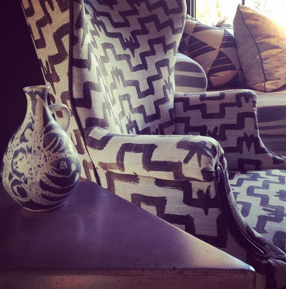


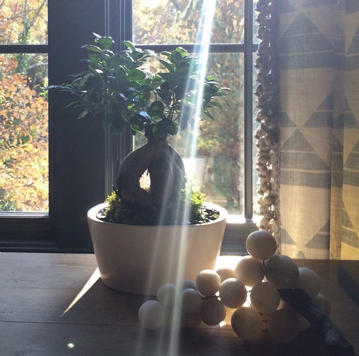



// CLOTH & KIND'S RESOURCES //
TEXTILES & RUGS
Clay McLaurin
Eliko
Ellisha Alexina
Fringe Market
Merida
Moattar
Peter Fasano
Zak+Fox
FURNISHINGS
Bradley
Bungalow Classic
Holland & Company
ART & ACCESSORIES
Agora Vintage
Ashley Woodson Bailey
Gillian Bryce // 214 Vintage Modern
Michael Simon
Sally King Benedict
Stephanie Schofield // 214 Vintage Modern
Susan Hable
LIGHTING
Coup D’Etat
Holland & Company
PAINT & WALLCOVERINGS
Sydney Harbour Paints
Zak+Fox
WORKROOMS
Beth Hodges Soft Furnishings
Dean Richardson Upholstery
WINDOWS
Antique Drapery Rod Company
The Shade Store
Zak+Fox
FLORAL & PHOTOGRAPHY
Amy Osaba Floral Event Design
Sarah Dorio
// SHOWHOUSE CONTRIBUTORS //
MAGAZINE
Atlanta Homes & Lifestyles
DEVELOPER
White Oak Development
ARCHITECT
Harrison Design Associates
BUILDER
Sheehan Built Homes
INTERIOR DESIGNERS
Amy D. Morris, Amy Morris Interiors
Barbara Heath, The Mercantile
Beth Webb, Beth Webb Interiors
Bill Ingram, Bill Ingram Architect, with Danielle Rollins, Gracious Living & Stylish Entertaining
Brian Patrick Flynn, FlynnSide Out Productions
Carter Kay and Nancy Hooff, Carter Kay Interiors
Krista Nye Schwartz and Tami Ramsay, CLOTH & KIND
Lance Jackson and David Ecton, Parker Kennedy Living
Liz Williams, Liz Williams Interiors
Margaret Kirkland, Margaret Kirkland Interiors
Mark Williams and Niki Papadopoulos, Mark Williams Design Associates
Michel Boyd, Smith Boyd Interiors
Randy Korando and Dan Belman, Boxwoods Gardens & Gifts
Susan Ferrier, McAlpine Booth & Ferrier Interiors
One final word of extra special thanks to Michelle Bradley of Bradley USA who has been the greatest CLOTH & KIND champion since day one. We love her dearly for so, so many reasons!
We had a visit from our Donghia rep this week and were completely enchanted with Pierre Frey's Spring 2015 Origines collection, which is a textile tribute to indigenous tribes from around the wold. Sandy, with its embroidery and shells, is a motif based on the necklaces made and worn by Aboriginal people and Kagura is a printed linen toile depicting partially overlapping traditional Japanese theatre masks in bold colors. Gorgeous, no?! We paired these two stunners with a versatile new Dominique Kieffer tweed and simply adore the fact that its salvage can be cut and used as a brush trim.
LEFT // Sandy in Lin/Corail from Pierre Frey (#F3022002)
MIDDLE // Kagura in Tutti Frutti from Pierre Frey (#F3009001)
RIGHT // Tweed Couleurs in Laguna from Dominique Kieffer by Rubelli (#17224-02)
FABRIC // Marble Skinny Dip from Hable Construction // Bowl // Cup // Print // Rug // Stool
EDITOR CREDIT // This post was developed and written by guest editor Molly Velte.
what is your idea of perfect design happiness?
NOTHING SHOUTING OUT IN THE ROOM.
what is your greatest fear in design?
TOO MUCH MEDIOCRITY.
which living designer do you most admire?
ROBERT KIME.
what profession other than design would you like to attempt?
THE TECH WORLD.
when and where were you happiest with your design?
NOW, I'VE GOT YEARS OF EXPERIENCE AND TONS OF ENERGY.
what do you consider your greatest achievement in design?
MY FIRST FABRIC COLLECTION.
if you died and came back as another designer or design object,
who or what do you think it would be?
MYSELF.
what specific design related talent are you lacking
that you would you most like to have?
DRAWING TRUE TO SCALE.
what is your most treasured design related possession?
MY TAPE MEASURE.
what do you regard as the lowest depths of misery in design?
USING ALL ONE COLOR.
what curse word do you most frequently use?
FUCK.
what is your favorite design related word?
REDO!
what is your least favorite design related word?
REPURPOSE.
what turns you on in design?
PERFECT PROPORTIONS.
what turns you off in design?
PEOPLE WHO DONT LISTEN.
what is your motto in design?
GO WITH YOUR INSTINCTS.
IMAGE CREDITS // Images provided by Kathryn M. Ireland.
ABOUT PROUST ON DESIGN // Answered by our design icons, these must-ask questions come from a 19th century parlor game made popular by Marcel Proust, the French novelist, essayist & critic. Proust believed the direct questions and honest responses that they elicited revealed the true nature of the individual. For this column, we have put a design related spin on the traditional questions. While this method has been used by many journalists throughout the years, we were primarily inspired by The Proust Questionnaire, which appears monthly on the back page of one of our all time favorite magazines, Vanity Fair (also Krista’s alma mater). Read all of the previous Proust on Design questionnaires here.
TOP RIGHT // Indian Clover in Charcoal on Flax from Virginia Kraft
TOP LEFT // Toureg from James Malone Fabrics
MIDDLE RIGHT // Jaguar from Sydney Harbour Paint Company
BOTTOM // Dohta in Charcoal on Flax from Virginia Kraft
ABOUT // Young Huh is the founder of Young Huh Interiors, a NY based full service design firm specializing in residential and commercial interiors.
I am sharing with you two pillows that I have in my living room. These are special to me because they were the first purchases I made for myself. I absolutely adore Fortuny fabrics, but I couldn't afford to cover an entire sofa or even a chair, so I had four pillows made in one of my all time favorite prints - Persiano. I chose the color seafoam green and white. It’s a classic persian flower motif that you see globally in textiles, but the Fortuny printing process gives each flower a unique quality - like a painting. The white background is not a pure uniform white, but slightly mottled and the green flowers have undertones of blue which gives the fabric a depth and singularity that continually interests me.
To accompany the Persiano pillows, I had others made in Fadini Borghi's Subbiano in color azzuro. The print looks like marbleized paper but it is woven - not printed - giving it wonderful color depth, sheen and texture. I love to get lost looking at the waves - its like looking at the ocean. While the green and blue colors carry me away to the sea and to a very peaceful place, the gold silk threads add glamour and contrast.
I made sure my workroom slightly understuffed the feather and down filling for the pillows. I don’t like pillows that look or feel too dense. Silk fringe and rope trim from Rogers & Goffigon complete their look. I sink into these pillows daily. I lay my head on them to read or take naps, behind my back for extra support. These pillows have become soft and pliant over the years, but they haven't lost a bit of their beauty or charm.