Thanks so much for including us in your coverage of the La Cienega Design District's 2014 Legends event, Elle Decor!
No. 36
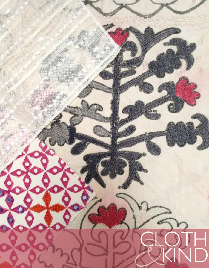
What a perfectly cheery Palette for this beautiful spring Friday morning, no? This is the last, but certainly not the least, of the Palettes we put together at Nicky Rising's showroom while out in LA for our LCDQ Legends extravaganza. We started with this vibrant interpretation of a suzani by our dear friend Mally Skok and layered on some complimentary Carlton V and Plumwich textiles. Here are the specifics.
RIGHT | Suzani Luv in Taupe/Pink from Mally Skok (#SL-02) TOP LEFT | Novara in Mustard from Plumwich (#K01-13-16-84) BOTTOM LEFT | Raffia Texture in Sisal from Carlton V (#WC106-3)
Have a fantastic weekend, guys!
The Gessi Concept Lab
This should have been our first clue that we were in for the ride of our lives at the Gessi Concept Lab in the heart of the Brera fashion district in Milan, Italy. As we first entered the building, we snapped pics on these adorable little vintage Vespas (the kind that everyone is dashing through the crowded streets of Milan on!) in front of the Gessi step and repeat before descending the dramatic set of stairs into one of the most unforgettable experiences of the entire BlogTour Milan trip.
What exactly is the Gessi Concept Lab, you ask? It is a luxurious multilevel wellness play space comprised of waterfalls and pools, stone, wood and surprising underground vertical gardens, all set up to showcase Gessi's bath and kitchen products but it feels like anything BUT a showroom. We will do our best to share this magical place that brings the beauty and elegance of the Gessi brand to life through our images and words, but in reality the only way to truly experience it is to be there yourselves. If you ever find yourself in Milan, we highly encourage a stop into the Concept Lab, which is open to the public. You won't want to leave, trust us!
The space is set up almost like a museum exhibit, and is titled The Bathrooms of the World. It includes seven installations with inspiration from Morocco, Japan, Russia, New York, Scandinavia, the Mediterranean and Bali. Perhaps what we loved most about the entire thing was Gessi's ability to mix their often times sleek and modern products with rustic, natural or timeless pieces of furniture and accessories to create that storied and layered look that we always seek in our own designs. Proof, yet again, that the best interiors include a variety of finishes, styles and tones mixed together to create the most interesting of patinas. Allow us to share a few of our personal favorite spaces from within the exhibit. First, the dramatic entrance to the space...
The Moroccan project features the traditional Tadelakt technique, a nearly waterproof plaster used in the palaces, hammams and bathrooms of Morocco. Special Moroccan lime is applied to the walls, which are then finished with river rocks and treated with a soft black or olive oil soap for water resistance. The beauty lies in the glowing, soft undulating touch of the individual artisan.
In a new twist on Oya stone, the Gessi Design Studio mixed slats of wood and sandblasted travertine in a Japanese bath. Created naturally from lava and ash, and known for its warm texture, Oya stone was used by Frank Lloyd Wright in 1923 for the facing of the Imperial Hotel in Tokyo. In this Gessi version of a Japanese bath, an original tansu-type piece with its signature hardware becomes a stunning vanity.
The epitome of cool, calm and collected, the Scandinavian-inspired bath blends limed pine, marble, stone and hemp, along with other materials. The mirror is framed with a special treatment of lime with a hemp-based coating.
In a fresh twist on time-honored Indonesian design, the Balinese bath features a rugged wood block wall and teak bench that contrast with slick stone walls, modern pedestal sinks and Italian faucets and showers.
As you can see from above, the use of the natural world throughout the space was incredible. A living wall, ferns draping over walls and mirrors, palm fronds abound. We loved it all!
Thank you, most sincerely, to the entire Gessi team for providing us with this once in a lifetime BlogTour Milan opportunity and for hosting us in your absolutely lovely Concept Lab. It's all an experience we won't soon forget. Ciao!
BlogTour Milan Sponsors | Modenus, BLANCO America, Gessi, Clever Storage by Kesseboehmer, Dekton by Cosentino, National Kitchen and Bath Association (NKBA).
Image Credits | Krista Nye Schwartz & Tami Ramsay of CLOTH & KIND & Gessi.
Lonny + Detroit Home
Hot off the presses! CLOTH & KIND is featured in the new Lonny June 2014 issue as well as the Summer 2014 issue of Detroit Home. A heartfelt congratulations to Lonny market editor, Catherine Dash, who was recently married in Athens, GA. She enlisted Tami (who, if you didn't already know, is a crazy talented floral stylist) and Mandy O'Shea of 3 Porch Farm for the floral design.
Detroit Home graciously included Krista, for her inaugural appearance in this local publication which she loyally reads each month, in their Inspired Designers feature, showcasing her daughter Tahlia's bedroom.
Deep gratitude for including us, Detroit Home & Lonny! xx
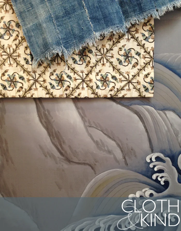
Palette No. 35
We've been so busy working on client projects and getting our new website ready for launch (sneak peek below) that somehow a whole week has gone by with nary a blog post! ... but Friday just wouldn't be Friday without Palette. TOP RIGHT | Vintage Hand Dyed Throw from Mali, available at Nicky Rising TOP LEFT | Tashkent Embroidered from Tulu Textiles BOTTOM | Matsushima Wave Wallpaper from de Gournay
Thanks again to our dear friend Nicky Rising who allowed us to crash her beautiful showroom for an afternoon and put together several Palettes while we were in LA for our LCDQ Legends 2014 event. We could have developed a year's worth of Palettes between her gorgeous stash of vintage textiles and the incredible lines of wallpapers and textiles that she represents.
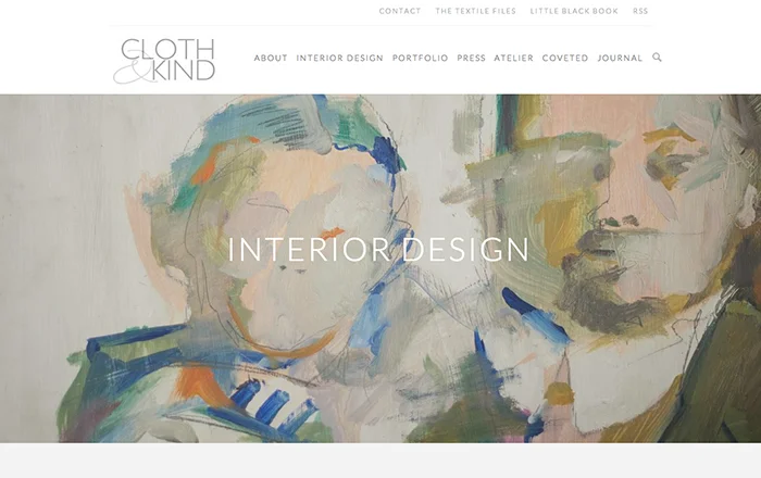
Oh, and here's a glimpse of our new site, launching very soon (we are SO, SO, SOOOO stinkin' excited about it!)
Happy weekend, guys! xx
No. 34
Another lovely Palette that we put together while in LA at Nicky Rising. Her stash of vintage textiles is to die for, and we particularly adored this antique Suzani prayer mat.
RIGHT | Antique Hand Embroidered Suzani Prayer Mat, Uzkekistan from Nicky Rising
TOP LEFT | Cloud Sheer in Tea from Carlton V (#DP113-8)
BOTTOM LEFT | Mahalaxmi in Rani Pink from Seema Krish (#1102-A) Wishing you a relaxing and wonderful Memorial Day weekend!
5 Custom Surface Concepts
We're the first to admit, we've always steered toward natural materials like marble, granite and if we're lucky and have a particularly adventurous client, more exotic stones like onyx, in projects whenever possible. Our curiosity was more than piqued, however, by a new ultra-compact surface that is revolutionizing the category with advanced technical properties for both interior and exterior design called Dekton.
While in Italy for Salone del Mobile with BlogTour Milan, we were able to experience Dekton first hand and learned all about its superior technical characteristics like the fact that it provides unique UV resistance for color stability outdoors and exceptional strength and performance. The product is also highly resistant to impact, scratches and abrasion for use in high-traffic areas and has very low water absorption. It provides thermal shock resistance against heat, frost and thawing, enabling the material to be used outside in any climate. Dekton most definitely harnesses the potential for design to flow from the indoors to outdoor spaces using one continuous product, which we think is incredible and have already started dreaming of using it in a beach front residence.
But perhaps the thing about Dekton that got us most excited is the ability to customize the surface with any texture or pattern that we can imagine. Our creative juices were flowing as we started brainstorming the ways in which we could customize this product to our hearts content. And for two girls with a penchant for fabric, texture and pattern, especially those inspired by nature, the possibilities are endless!
Here are the top five results of our little internal brainstorm on how we'd customize Dekton, the CLOTH & KIND way.
no. 1 | CANNA TROPICANA STRATO, TECH COLLECTION
no. 2 | WOOD GRAIN DANAE, NATURAL COLLECTION
no. 3 | EYELET ARIANE, SOLID COLLECTION
no. 4 | GINKO SIRIUS, SOLID COLLECTION
no. 5 | BURLAP KERANIUM, TECH COLLECTION
So which one is your favorite?! And where would you use it?
BlogTour Milan Sponsors | Modenus, BLANCO America, Gessi, Clever Storage by Kesseboehmer, Dekton by Cosentino, National Kitchen and Bath Association (NKBA).
Jeffrey Allan Marks
what is your idea of perfect design happiness? COMFORT, FIRST AND FOREMOST.
what is your greatest fear in design? TOO MANY ‘STATEMENT’ ITEMS IN ONE ROOM. THERE CAN’T BE TOO MANY ‘STARS’ IN THE SAME SPACE.
which historical design figure do you most identify with? MARK HAMPTON AND FRANCES ELKINS.
which living designer do you most admire? ALBERT HADLEY AND JOHN STEFANIDIS.
what profession other than design would you like to attempt? BOY BAND SINGER.
what is your greatest design extravagance? CASHMERE FROM BRUNELLO CUCINELLI.
when and where are you happiest with your design? EARLY MORNING, WHEN A SPACE IS CALM.
what do you consider your greatest achievement in design? MY RESTAURANT SPACES.
if you died and came back as another designer or design object, who or what do you think it would be? DAVID HICKS.
what specific design related talent are you lacking that you would you most like to have? DRAWING.
what is your most treasured design related possession? MY ART.
what do you regard as the lowest depths of misery in design? BAD ‘EXISTING’ CLIENT RUGS.
what curse word do you most frequently use? I DON’T REALLY CURSE.
what is your favorite design related word? TAILORED.
what is your least favorite design related word? BUDGET.
what turns you on in design? CLIENTS WHO ARE CREATIVE AND OPEN MINDED.
what turns you off in design? CLIENTS WHO ARGUE.
what is your motto in design? MAKE IT MEAN SOMETHING!
IMAGE CREDITS | Images provided by Jeffrey Allan Marks.
ABOUT PROUST ON DESIGN | Answered by our design icons, these must-ask questions come from a 19th century parlor game made popular by Marcel Proust, the French novelist, essayist & critic. Proust believed the direct questions and honest responses that they elicited revealed the true nature of the individual. For this column, we have put a design related spin on the traditional questions. While this method has been used by many journalists throughout the years, we were primarily inspired by The Proust Questionnaire, which appears monthly on the back page of one of our all time favorite magazines, Vanity Fair (also Krista’s alma mater). Read all of the previous Proust on Design questionnaires here.
Bright Bazaar (+ a Giveaway!)
'Will understands the life-enhancing abilities of color. He’s a true talent with a keen eye.' - Jonathan Adler
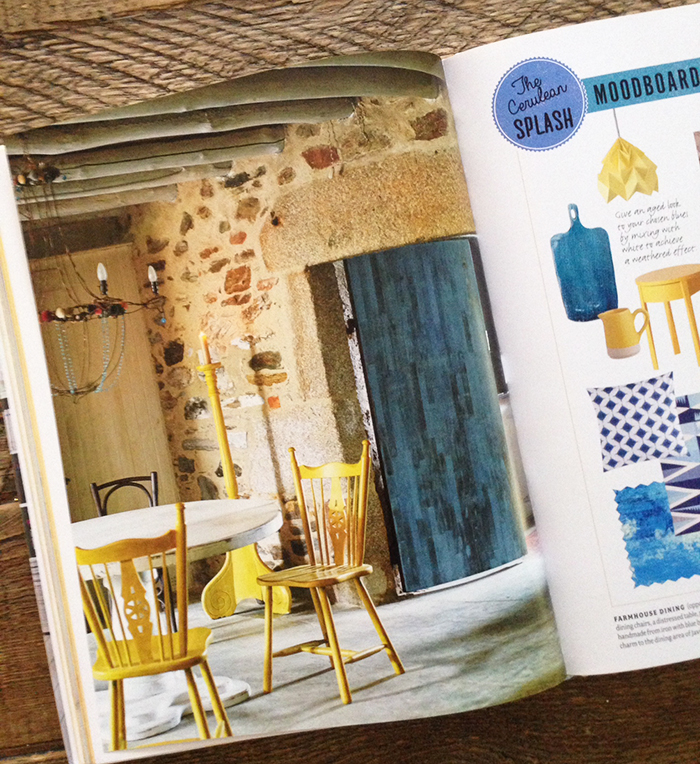
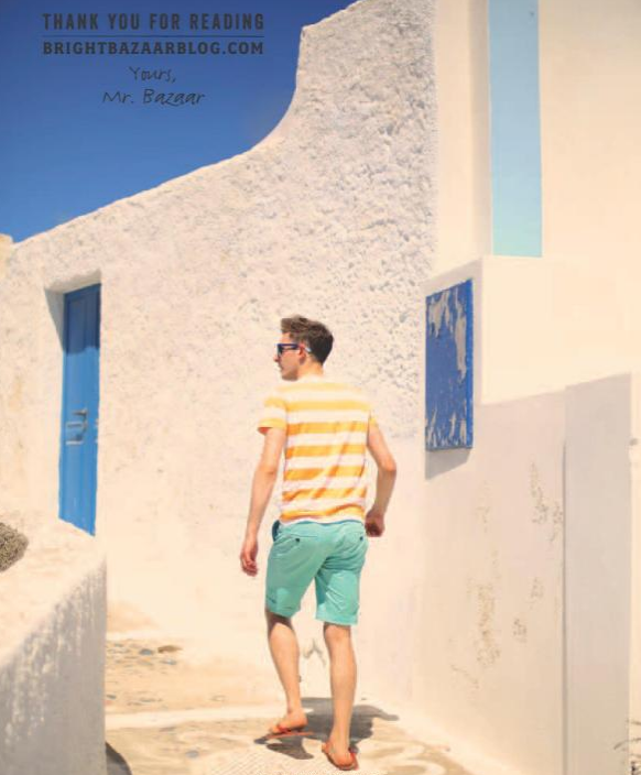
Will Taylor (aka Mr. Bright Bazaar), one of the world’s leading interior design bloggers who just happens to be a sweet and kind friend of ours has written the most fantastically cheerful book titled Bright Bazaar, Embracing Color For Make-You-Smile Style.We simply can not say enough about it! The pages so perfectly capture Will's effortless, inclusive and oh-so-colorful approach to design and life. Throughout the book, Will shares his secrets to choosing colors with confidence for every room in the house, and he offers up recipes for 'Color Cocktails' in a range of palettes from 'The Strawberry Split' & 'The Citrus Twist' to 'The Cerulean Splash,' which help guide you to discover your own personal color palette preferences.
We can practically hear the oohs and ahhs coming through our computer screens and yes, we know you want a copy of your own! So, we have a little giveaway. Will has so graciously signed a copy of the book which we'll be sending off to one lucky CLOTH & KIND reader. Check him out...how adorable is he?!
To enter, simply leave a comment here on the blog telling us what your favorite color to use in interiors is AND follow CLOTH & KIND on one additional social media channel (Pinterest, Facebook, Twitter or Instagram - Krista & Tami). We'll select a random winner next Friday, 05.30.14.
Good luck! Oh, and if you just can't wait to see if you're the lucky winner, you should go ahead and order the book here. It'll be worth every single one of those 32 colorful greenbacks you part with, we promise.
IMAGE CREDITS | All photographs of Bright Bazaar, Embracing Color For Make-You-Smile Style taken by Krista Nye Schwartz of CLOTH & KIND with permission from Will Taylor/Bright Bazaar.
Kitchen Trends + NKBA
BlogTour Milan: Salone Kitchen Trends + NKBA | CLOTH & KIND
We had such fun walking the endless EuroCucina at Salone del Mobile while there with BlogTour Milan this past month and wanted to share some of the most prominent kitchen trends that we spied. And, because we're fortunate enough to be connected with the NKBA (National Kitchen and Bath Association), we asked current President, John Petrie, and President Elect, Maria Stapperfene to weigh in with their opinions on this topic as well. Here are our collective thoughts on the best kitchen trends, straight from Milan.
One thing there was no shortage of this year at Salone del Mobile were massive kitchen islands, and islands that doubled as tables with seating for 6-8+, some constructed with a variety of materials, many rough hewn and/or purposely left with unfinished details. Perhaps the most decadent example of the behemoth island was at the Armani Dada showroom where we saw a stunningly huge and equally thick marble slab that pushed back with the touch of one finger to reveal functional island storage below it.
'We saw several large islands at EuroCucina. Many were designed with different counter surfaces. I think the trend has already started here in the US and will only get stronger. The trend for 'open kitchens' continues to grow here in the states, which allows for larger islands with integrated seating and innovative storage.' - John Petrie
As far as we are concerned, highly functionally yet innovative kitchen and bath cabinet design is the mark of a true genius. We saw multiple examples of this all over Salone in EuroCucina and were especially impressed with the clever use of that oft-designed vacuous hole under your sink or cooktop. Turns out, if designed well, it can organize and store all kinds of things! Who knew?!
'I was struck by the use of drawers for storage, especially under the kitchen sink. Very clever.' -John Petrie
Color and mixed metals were abundant at this year’s Salone del Mobile. Interesting splashes of vibrant hues rocked light fixtures and cabinetry in kitchen and bath alike, including whimsical touches like the inside of this vibrant green sink paired with a patinaed brass faucet. The lesson here is for us all to take a colorful cue from our friends across the pond and embrace color where we’ve traditionally gone safe and neutral.
'There was a plumbing manufacturer that had lime green fixtures along with yellow and orange - this was pretty surprising! While a mix of colors and woods seemed to be pretty prevalent, there was one appliance manufacturer that stood out - BEST hoods. They had lots of colors! They even had bold colored designs and patterns on their hoods. All lined up in rows looking like a dessert bar which was fun and fabulous. Color makes us happy.' - Maria Stapperfenne
So, tell us. Which of these trends would you incorporate into your own kitchen (...and which wouldn't you dream of)?
BlogTour Milan Sponsors | Modenus, BLANCO America, Gessi, Clever Storage by Kesseboehmer, Dekton by Cosentino, National Kitchen and Bath Association (NKBA).
Image Credits | Krista Nye Schwartz & Tami Ramsay of CLOTH & KIND, Chasen West Photography for BlogTour Milan

