Spring IV

Anatomy of Flora: Spring IV | CLOTH & KIND

Lady spring is soon to close her shades, and with that will bring to an end a particular, but short lived, soft clear light and warm bask. The bounty of lush flora that truly defines spring will give way to long, hot summer days and, at least in my neck of the woods, leave fauna wilting on the vine from the weight of the heat and humidity. As a gardener, the best part of spring is sharing the wealth of that lush bounty with other gardeners. The antique english roses and peonies above, snipped from the garden of friend, coupled with a trailing vine of wild honeysuckle, pretty much say everything you need to know about spring.

So, as we find ourselves on the heels of the summer solstice, let's soak up these last few days and bask in the soft clear light and warm sun of spring. Another season awaits.

IMAGE CREDITS | Floral arrangement & photography by Tami Ramsay of CLOTH & KIND

Kari Fisher

Limelight: Kari Fisher | CLOTH & KIND

Hi. My name is… Kari Fisher.

My company is… Kari Fisher Designs.

I’m the… Founder, Owner, Designer.

I make/design/create… I design & create made-to-order pillows sewn from my own hand-blocked linen. Inspired by my love of textiles and traditional block printing methods, I design each pattern and carve my blocks from my Atlanta studio.  Every pattern is blocked using water-based ink. Presently, there are three linen grounds, 8 patterns, and several ink colors. I also offer 3 different trim options including linen self-flange, color cording, and pom pom tassels. So many options allows for numerous combinations to fit almost anyone’s décor or style.

Limelight: Kari Fisher | CLOTH & KIND

Something you need to know about me is… I think what makes me and my business unique is my interior design background. I understand the needs of the designer and the client, how important quality, customization, and ultimately price are to consumers. I’ve worked under amazing designers like Victoria Hagan & Robert Brown. For them quality, classic forms, and honesty in materials have been at forefront of their design aesthetic and their mentoring has definitely influenced my own style & perspective.

Here’s how this company came to be… I’ve always played around with manipulating textiles and have grown up painting. As an interior designer & textile addict I’ve had my hand on most fabrics out there. I’m always playing with new pattern and color combinations, but there were always situations where I couldn’t find the exact pattern or color I was looking for. The turning point was as designer with KMH Interiors. We were designing a chic condo for an Atlanta Homes & Lifestyles show house and were looking for an inexpensive drapery option that had a high-end custom feel. We ended up purchasing some pre-made white linen drapery panels and I designed a simple block that gave us the pattern we wanted. It was like all of the sudden, everything clicked for me. Block printing was the perfect medium for all of the designs floating around in my head.

Limelight: Kari Fisher | CLOTH & KIND

My absolute favorite thing we sell right now is… I’m really loving how custom & unique my pillows can become with trim embellishments. My favorite right now is the wabi stripe with pom pom tassels…my pom poms have added a totally new dimension to my pillows. I love how through color and embellishment my fabrics can be either subtle & elegant or colorful & funky.

Limelight: Kari Fisher | CLOTH & KIND

Here’s a sneak peek of something we’re working on now… I’ve been playing around with some hand painting, especially florals. Pillows are in many ways my canvas so I can really experiment with new ideas without sacrificing yards and yards of fabric and they are so easy to change out in one’s decor. Right now my patterns are one color, but I’m experimenting with using a couple different colors and layering patterns.

Limelight: Kari Fisher | CLOTH & KIND

I’m most proud of… Making the scary leap to start my own business. It’s stressful not knowing what will happen down the road, but I’m so proud of the work I’ve accomplished since going out on my own. I wake up early ready to go and am so excited to bring my ideas to life.

I really detest… Bookeeping is a constant struggle.

I could never have done it without this person… I’m really lucky to have a number of people supporting me & fostering my creativity, but I owe everything to my parents. I grew up painting with my mother who showed me I’m only limited by how far my imagination can take me. She recently took her support to a whole new level when she got her very first tattoo. As a bonding moment with my brother she had me rework my fish “Matsya” print to include my brothers’ and my first initials. A little silly, but that’s why I love her. As creative as my mother is, my father is very business minded and pragmatic. He has been the much appreciated voice in my head making sure I cross my “t”s and dot my “i”s.

I consistently read these for inspiration… I love when I get a chance to curl up with an Elle Decor or House Beautiful, a glass of wine, and a sharpie. I also often go back to my favorite design books like Owen Jones Decorative Ornament or Dorothy Draper’s Decorating is Fun. I’m a very visual person so Pinterest & Instagram are never-ending sources of inspiration.

I would like to share the limelight with… Probably the best upholstery & custom furniture workroom out there is Bjork Studio. If you can dream it, they can make it and better. Not only do they produce great furniture pieces with amazing attention to detail, they are also wonderful people that have been extremely supportive and champions of me & my textiles.

Limelight: Kari Fisher | CLOTH & KIND

Weathered & Raw

Inspired: Weathered & Raw | CLOTH & KIND

Wild Allium | Feathers & Scissors | Tracks | Mock Orange | Rock & Shell | Sleep

While textiles serve as ongoing inspiration for our projects, the natural world beckons with its siren song and greatly informs our design aesthetic. The fine and exquisite certainly have a place in our interiors but are false idols until softened with the weathered and raw. The balance of high and low coupled with an eclectic patina, one that tells a story, is always what we are after and in the end truly defines our interiors. How do you tell your story?

Palette No. 19

Palette No. 19 | CLOTH & KIND

For the specific fabrics & wallpaper used in Palette No. 19, please subscribe to CLOTH & KIND’s emails. Details are provided exclusively to our email friends.

A special thanks to our Palette sponsor, Studio Four, who has graciously provided two of the memos used in today's post. Happy Friday!

Provenance: Byobu


prov-e-nance \ˈpräv-nən(t)s, ˈprä-və-ˌnän(t)s\noun. the place of origin or earliest known history of something.

Guest edited by Jacqueline Wein, Tokyo Jinja

Provenance: Byobu | Guest Edited by Jacqueline Wein, Tokyo Jinja | CLOTH & KIND

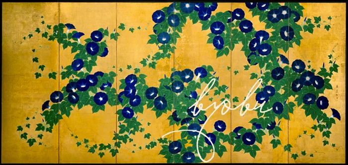
Perhaps the very essence of Japan can be found in the hand painted screens, called byobu, which have flourished as an art form in Japan since the 8th century. Byobu literally means “wind wall”  which gives a clear sense of their original purpose – to block drafts. Over time, their mobility and flexibility allowed them to be used almost anywhere, to block unsightly objects or repurpose a room, as well as serving as beautiful backdrops for tea ceremony, ikebana and visiting dignitaries. Ornate screens and those using gold and silver leaf helped proclaim the status of their owner. Like much of Japanese artwork, screens originated in China but were slowly but surely domesticated and changed in Japan, with a high point being the introduction of paper hinges, allowing the artist a single large canvas to create an image, rather than completely divided panels.

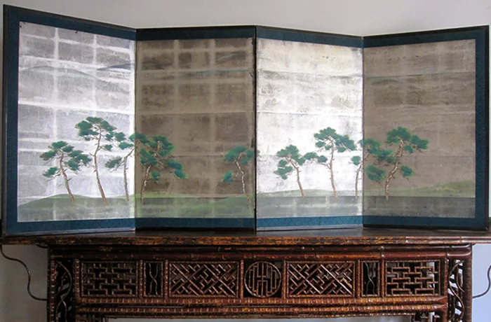
I considered writing on other subjects this month, but with my imminent departure from Tokyo, I realized that I had to cover something very near and dear to my heart. Add to that my discovery, at a big antiques fair earlier this month, a divine silver leaf byobu painted with naturalistic pine in the richest of greens and my topic was set.

Provenance: Byobu | Guest Edited by Jacqueline Wein, Tokyo Jinja | CLOTH & KIND

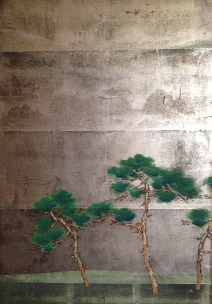
Of course this beauty came home with me where I cannot stop admiring the finesse of the painter who implied mountains in the background with the merest hint of line. The silver leaf literally seems to glow as if lit from within.

Provenance: Byobu | Guest Edited by Jacqueline Wein, Tokyo Jinja | CLOTH & KIND

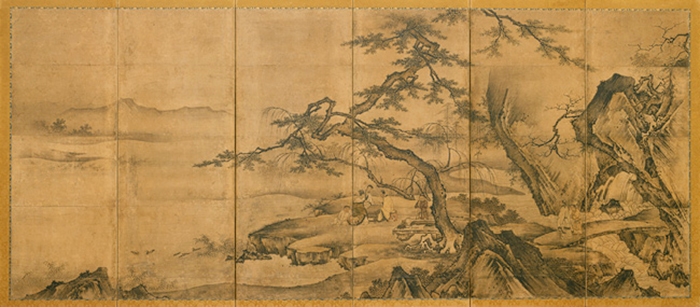
The period between the late 16th to the 17th century is considered the "golden age" of byobu painting, with daimyo and samurai leaders commissioning works of art on a large-scale, designed to decorate their castles and awe their constituents with their wealth and power. Screens from this period often continue to reflect a bold Chinese heritage and make free use of bold brushstrokes and Zen themes.

Provenance: Byobu | Guest Edited by Jacqueline Wein, Tokyo Jinja | CLOTH & KIND

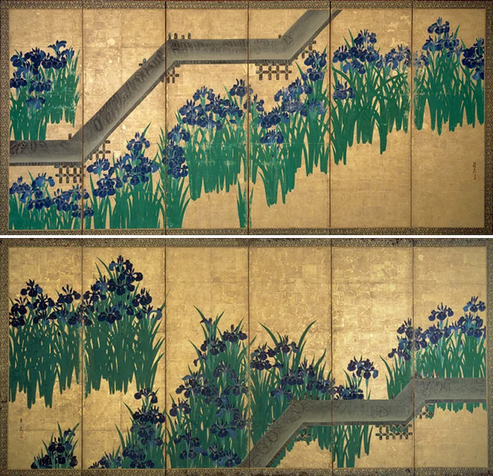
Prosperity under the Tokugawa shogunate from the early 17th century through the mid-19th century, encouraged painters of various schools to create screens in many different styles – not just for the samurai and aristocratic elites, but for wealthy farmers, artisans and merchants. The Kano school is perhaps the most well-known, being the dominant school style for nearly 400 years. The Kano family itself produced many great artists and many students of the school went on to take the Kano name. The Rinpa school, created in 17th century Kyoto, is one of the other most famous schools, known particularly for the work of brothers Ogata Korin and Ogata Kenzan. I have written about the Ogata Korin iris masterpieces before, and they continue to be some of my favorites.

Provenance: Byobu | Guest Edited by Jacqueline Wein, Tokyo Jinja | CLOTH & KIND

Other schools include the Tosa school, whose subject matter and techniques derived from ancient Japanese art, as opposed to schools influenced by Chinese art, notably the Kano school. However, by the late 17th century divisions between schools had become less marked as the artists willingness to experiment broadened.

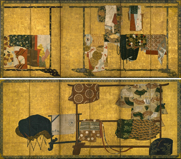
As the breadth of topics widened, so too did screen commissioning and ownership. Most common were pairs of full height 6 panel screens, but other shapes and sizes proliferated with specific names and uses. Topics such as the four seasons, flower studies and detailed works featuring the Tale of Genji and other stories were popular. I particularly enjoy some of the more casual screens showing everyday life - like this pair of tagasode screens - meaning "Whose Sleeves?" a common theme depicting beautiful kimonosdraped across a wooden rack. Generally unsigned, tagasode screens are thought to have been painted by local artists whose ready-made works were sold to buyers off the street, rather than being commissioned.

Provenance: Byobu | Guest Edited by Jacqueline Wein, Tokyo Jinja | CLOTH & KIND

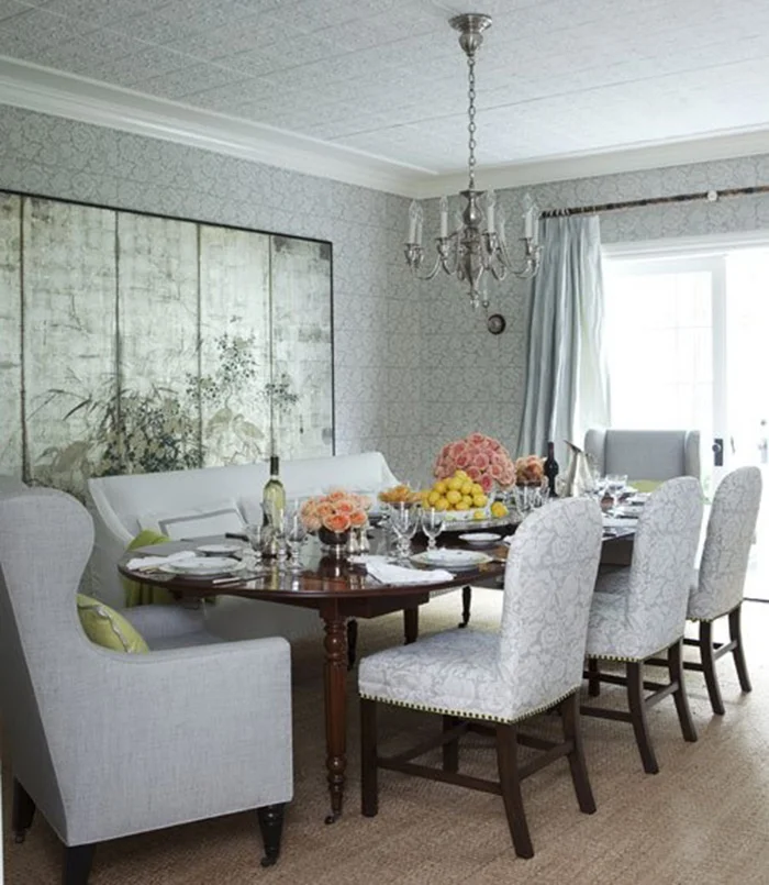
Today, screens are more likely to be hung on the wall rather than stood on the floor. They lose some of their visual movement that way, but it also enhances the viewers ability to encompass the painting directly. I love the parallel between the silver leaf grids in the screen and the Bennison fabric pattern in this room by Windsor Smith.

Provenance: Byobu | Guest Edited by Jacqueline Wein, Tokyo Jinja | CLOTH & KIND

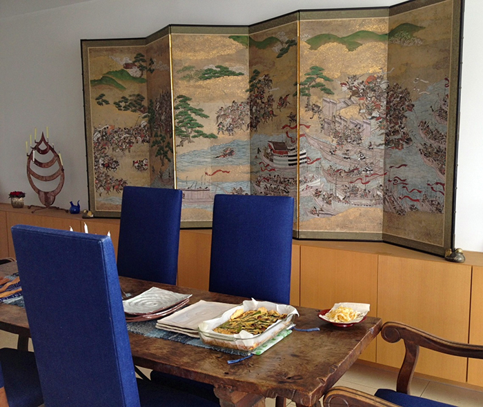
Finely detailed story screens like this 17th century byobu depicting the Genki Heike Battle between the Minamoto clan and the Taira clan may have had their heyday in that century, but feel just as relevant today when mixed with an antique Spanish refractory table and patchwork boro in Amy Katoh's riverfront home.

Provenance: Byobu | Guest Edited by Jacqueline Wein, Tokyo Jinja | CLOTH & KIND

Their detail or simplicity, their ever-changing response to light, their functionality and portability and their ability to work in any style decor, make byobu any decorator's best friend. For more images and information about these Japanese beauties, you can visit my blog Tokyo Jinja and my Byobu Board on Pinterest.

Have you used byobu in your home or a client project? We'd love to hear about it.

IMAGE CREDITS | All byobu screens via The Metropolitan Museum of Art, other credits as noted and linked to in the post above.

Laura Kirar

Proust on Design: Laura Kirar | CLOTH & KIND

what is your idea of perfect design happiness? BEING SURROUNDED BY NATURE, ENVIRONMENTS AND OBJECTS THAT INSPIRE WONDER.

what is your greatest fear in design? FEAR ITSELF.

which historical design figure do you most identify with? EILEEN GRAY.

which living designer do you most admire? MAYA ROMANOFF FOR HIS TALENT, INNOVATIONS AND PERSEVERANCE.

Proust on DesLaura Kirar | CLOTH & KIND

what profession other than design would you like to attempt? PRODUCER.

what is your greatest design extravagance? RESTORING MY HACIENDA IN THE YUCATAN.

when and where were you happiest with your design? WHEREVER I AM IN THE DESIGN PROCESS - BEING IN THE PRESENT.

what do you consider your greatest achievement in design? THAT I EVOLVE AS AN ARTIST AND CONTINUE TO PRODUCE NEW RELEVANT WORK.

if you died and came back as another designer or design object, who or what do you think it would be? MICHELANGELO.

what specific design related talent are you lacking that you would you most like to have? BETTER TIME MANAGEMENT.

what is your most treasured design related possession? MY SAPPHO CUFF BY LORAE RUSSO. IT'S THE PERFECT COMBINATION OF NATURE, STRENGTH AND SENSUALITY.

Proust on Design: Laura Kirar | CLOTH & KIND

what do you regard as the lowest depths of misery in design? DISPOSABLE DESIGN. INJECTION MOULDED PLASTICS AND OTHER “LANDFILL WAITING TO HAPPEN”.

what curse word do you most frequently use? FUCKING HELL.

what is your favorite design related word? ELEGANT.

what is your least favorite design related word? ECLECTIC – REALLY WHAT DOES THAT MEAN?

what turns you on in design? LONGEVITY.

what turns you off in design? TRENDINESS.

what is your motto in design? BETTER TO CREATE ONE INCREDIBLE THING IN 10 DAYS THAN 10 MEDIOCRE THINGS IN ONE.

//

IMAGE CREDITS | Laura Kirar photographed by Soohang LeeMaya Romanoff, Lorae Russo.

ABOUT PROUST ON DESIGN | Answered by our design icons, these must-ask questions come from a 19th century parlor game made popular by Marcel Proust, the French novelist, essayist & critic. Proust believed the direct questions and honest responses that they elicited revealed the true nature of the individual. For this column, we have put a design related spin on the traditional questions. While this method has been used by many journalists throughout the years, we were primarily inspired by The Proust Questionnaire, which appears monthly on the back page of one of our all time favorite magazines, Vanity Fair (also Krista’s alma mater). Read all of the previous Proust on Design questionnaires here.

Fab Five: Katie Leede

Fab Five: Katie Leede

We're thrilled to welcome guest editor Katie Leede to the blog today, where she's sharing her personal Fab Five...

1 | I NEVER tire of these luscious Rosemary HallgartenSuri pillows because you can actually PET them! They are delicious and fun for the whole family!

2 | Rose Tarlow now makes this gorgeous  hand dyed , hand woven fabric in Senegal that just makes my heart hum... so usable though it ain't cheap (about $268 a yard)... but the look and feel of the design adds an instant world culture vibe into a room without sacrificing  high end chic and class. Know what I mean?

3 | My friend and artist extraordinaire Nancy Lorenz has just created new work where she layers gesso and gold leaf on top of cardboard of all things. The cardboard gives a watery, ripple like effect to the surface of her "canvas" which I find edgy and appealing. And there is something wonderfully decadent and earthy about using something so valuable on such humble, knock about material. Available through Morgan Freeman Gallery in NYC.

4 | I have several of  these Boucle Alpaca throws from De Le Cuona at home which are highly textural, decorative, and groovy things visually as well as being cozy and comforting to use while cuddled up with my five kids and beau, watching Game of Thrones.

5 | I used this artful Flame of Forest chandelier from Stefanie Odegard Collection in a Showhouse in the Hamptons last Summer and I still dream about using it in  a project some day. Being a romantic, this fixture - of course - reminds me of papyrus plants on the Nile at sunset.

Below I used FOUR  of my Fab 5 in the same room - the Flame of Forest Chandelier, a Nancy Lorenz triptych over the bed, the alpaca throw draped across the sheets and a Suri pillow on the slipper chair. The Rose Tarlow fabric hadn't been created yet but it would have looked, well, FAB, in the space too, don't you think?


Fab Five: Katie Leede


Thank you, Katie! We adore your Fab Five selections and loved seeing how you used several of them in a room that you designed. For those of you who have not yet seen it, be sure to check out Katie's Proust on Design interview from last summer.

Fibers Underfoot

Inspired: Fibers Underfoot | CLOTH & KIND

It goes without saying that we are obsessed with textiles but what really turns us on are the artisans behind the handiwork. We had the pleasure of spending yesterday surrounded by gorgeous antique rugs literally up to our ears, and in midst of talented textile artists who painstakingly repair the wear and tear. Although we selected several beautiful rugs to be shipped for interior projects, our favorites, hands down, were the combination of the plaited jute and Moroccan kilim rugs above.

Inspired: Fibers Underfoot | CLOTH & KIND

Inspired: Fibers Underfoot | CLOTH & KIND

Inspired: Fibers Underfoot | CLOTH & KIND

Inspired: Fibers Underfoot | CLOTH & KIND

We are off for another packed day before heading home late this afternoon, so with coffee in hand we are hitting the streets for Studio Four NYC. What's on your agenda for today?

IMAGE CREDITS | All images taken by Tami Ramsay of CLOTH & KIND

Spring III

Anatomy of Flora: Spring III | CLOTH & KIND

It's a rainy day in New York City and while we are so happy to be here shopping & scouting, we're dreaming of sunny days & freshly cut flowers.

It's hard to ever go wrong with nodding blooms and glossy greens gathered in a vase, but we are gobsmacked over the beautiful pairing of this antique yellow English rose snipped from a friend's garden gate paired with the delicate yet bold and deeply veined fatsia japaonica leaf. As in life, sometimes simple is the most sophisticated. This is definitely the case here where flora and fauna gather to float in a pool of water, all nestled in a footed venetian glass vase.

Anatomy of Flora: Spring III | CLOTH & KIND

So while we trudge through the rain in the Big Apple, here's to brightening your Monday morning where ever you are.

IMAGE CREDITS | Floral arrangement & photography by Tami Ramsay of CLOTH & KIND

Babi Ahluwalia

Proust on Design: Babi Ahluwalia | CLOTH & KIND

what is your idea of perfect design happiness? TO ENVISION AN IDEA OR SOMETHING IN MY MIND AND THEN BE ABLE TO FIND THE RESOURCES TO EXECUTE IT. PERFECTION WOULD BE FINALLY SEEING THAT THE APPLICATION OF MY IDEA HAS EXCEEDED MY INITIAL VISION FROM ITS CONCEPTION.

what is your greatest fear in design? I HAVE NO FEAR IN DESIGN.

which historical design figure do you most identify with? MAHARAJA OF PATIALA. THE REGALITY OF HIS AURA, AND IN ESSENCE, ALL THE ROYALS FROM INDIA, IS AWE INSPIRING.

which living designer do you most admire? OSCAR DE LA RENTA BECAUSE OF HIS TIMELESS STYLES AND SUCCESSFUL LONGEVITY.

Proust on Design: Babi Ahluwalia | CLOTH & KIND

what profession other than design would you like to attempt? SOMETHING IN THE CREATIVE FIELD SUCH AS ADVERTISING OR CALLIGRAPHY.

what is your greatest design extravagance? MY PROCLIVITY TO TRAVEL AROUND THE GLOBE FOR INSPIRATION.

when and where were you happiest with your design? IT’S HARD TO PICK ONE MOMENT. AS LONG AS I AM DOING WHAT I LOVE MORNING, NOON, AND NIGHT, I WILL ALWAYS BE HAPPY.

Proust on Design: Babi Ahluwalia | CLOTH & KIND

what do you consider your greatest achievement in design? MY TWO STORES IN NEW YORK. ANKASA MADISON AND ANKASA SOHO.

if you died and came back as another designer or design object, who or what do you think it would be? A TOOL USED TO EXPRESS SOMEONE’S CREATIVITY - AN EASEL, OR BRUSH OR PENCIL.

what specific design related talent are you lacking that you would you most like to have? A DEEPER UNDERSTANDING OF THE FORM OF DESIGN WOULD HELP SHAPE MY OVERALL UNDERSTANDING OF WHAT IT MEANS TO BE A DESIGNER.

what is your most treasured design related possession? MY MOST TREASURED POSSESSIONS AREN’T TANGIBLE OBJECTS BUT RATHER TRAITS THAT I HOLD DEAR SUCH AS MY KEEN EYE AND MY ABILITY TO VISUALIZE THINGS.

Proust on Design: Babi Ahluwalia | CLOTH & KIND

what do you regard as the lowest depths of misery in design? KNOCK-OFFS.

what curse word do you most frequently use? BLEEP! BLEEP! BLEEP! (I KNOW HOW TO USE THE F--- WORD).

what is your favorite design related word? ANKASA IT! (USED AS A VERB).

Proust on Design: Babi Ahluwalia | CLOTH & KIND

what is your least favorite design related word? PRICING!

what turns you on in design? ALL THE MYSTERY THAT IS INVOLVED IN CREATING AND THE INFINITE POSSIBILITIES THAT LAY AHEAD.

what turns you off in design? NOTHING REALLY!

what is your motto in design? WHEN I’M WORKING WITH MY TEAM MY FAVORITE SAYING IS “KEEP IT RELEVANT".

//

IMAGE CREDITS | via Ankasa and Sachin + Babi. Oscar de la Renta photo via Zaid Hamid.

ABOUT PROUST ON DESIGN | Answered by our design icons, these must-ask questions come from a 19th century parlor game made popular by Marcel Proust, the French novelist, essayist & critic. Proust believed the direct questions and honest responses that they elicited revealed the true nature of the individual. For this column, we have put a design related spin on the traditional questions. While this method has been used by many journalists throughout the years, we were primarily inspired by The Proust Questionnaire, which appears monthly on the back page of one of our all time favorite magazines, Vanity Fair (also Krista’s alma mater). Read all of the previous Proust on Design questionnaires here.