Inspired

Pulp Design Studios + S. Harris

CLOTH & KIND // Inspired, Pulp Design Studios + S. Harris

We want to give a huge shoutout to our badass friends over at Pulp Design Studios!  Co-Founders and Principal Interior Designers Carolina V. Gentry and Beth Dotolo just debuted an insanely cool textile line in collaboration with S. Harris!  Major heart eyes, check it out here and also feast your eyes below.

CLOTH & KIND // Inspired, Pulp Design Studios + S. Harris

Beth & Carolina describe pulling from their love of adventure when working through the product development phase, and it is undeniably apparent in each and every pattern and colorway.  From jewel-toned Art Deco-esque patterns to globally inspired designs in bright colors, the Pulp Design Studios and S. Harris collaboration has us endlessly inspired.  

CLOTH & KIND // Inspired, Pulp Design Studios + S. Harris

From one design duo to another, we are sending all of our love to y'all and can't wait to begin incorporating your fabrics into our design projects!!

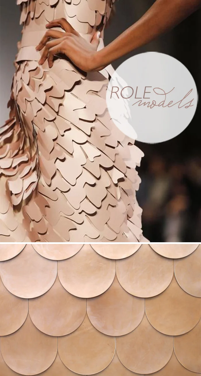
Role Models: James Malone + Alexander McQueen

Role Models: ZAK+FOX & Gareth Pugh

Role Models: Chakra + AVO

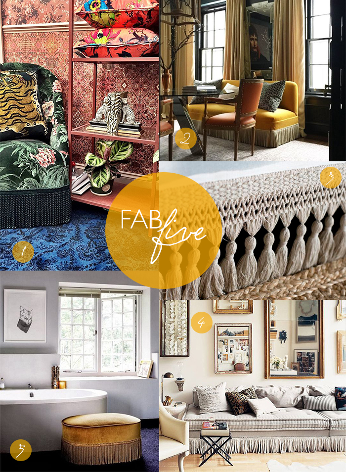
Fab Five: Fringe

CLOTH & KIND // Fab Five, Fringe

1. House Of Hackney // Loddiges Chair
2. Garrow Kedigian // Chelsea Place, Montréal, Canada
3. CLOTH & KIND Interiors // Custom fringe by Fringe Market
4. Bullion Fringe Sofa // Photograph by William Abranowicz
5. Gold Fringe Ottoman // House and Leisure Magazine

Meet Schumacher's Director of Design, Pam Marshall

As long time lovers of venerable textile house, Schumacher (who isn't?!), we've thoroughly enjoyed watching Dara Caponigro work her magic since taking the helm as Creative Director last September. Turning tradition on its head, Schumacher is shaking things up big time - including going bold from a design standpoint and launching a brand spankin' new collection each and every month. Leading this charge from a design development & production standpoint is Pam Marshall. Y'all are going to enjoy her enthusiastic responses as much as we did, we're quite certain!

CLOTH & KIND // Meet Schumacher's Director of Design, Pam Marshall

C&K // Tell us about your role at Schumacher.

PM // As Director of Design, I lead the Schumacher studio in the development and production of our entire product line. This encompasses all categories: prints, wovens, wallcovering and trims. We begin with a collection concept, which I work on with Dara Caponigro, our Creative Director. Inspiration can come from several vantage points. We collaborate on design ideas, production methods (is it an embroidery? Is it a print?) and choose the ultimate way to realize each design. Once that is set, we begin the process of creating the designs and colorways for each. I initially discuss this with our two amazingly talented senior designers, Hilary Pharr and Allison Block. I definitely do not subscribe to set color palettes, each design has a very unique personality and mood. I strongly believe that the color should fit the design, not the other way around. Seeing color is an emotional experience, and you need to strike the right chord. Once everything has been developed, we do a final edit of the designs and colorways in each collection to check that they have translated in a way that speaks to the Schumacher brand. Anything that is not quite right does not make the cut. All of our designers work across all product types, which is unique. They are an incredibly talented team, each bringing a different view to design and color. We have a very fluid and collaborative way of working, and it is reflected in our product.

C&K // How does what you're doing now differ from how you have worked at Schumacher in the past?

PM // It has been a career highlight to be a part of Schumacher’s recent evolution. In the past, while we still created beautiful products, we approached everything in a very expected, formulaic manner. I suppose that there is a certain amount of safety in routine, but with that comes stagnation. I actually believe this had become an industry wide issue, and is ultimately what signaled the need for someone to lead the change. We are now launching collections monthly, have the most agile, forward thinking design and marketing teams, and are continually addressing trends while they are at their peak of relevance. We are also one of the few companies still creating original artwork in-house, which gives our product a definite edge. It is a challenge for a brand as historic as Schumacher to evolve while staying true to its’ roots. We have achieved that, and we are stronger than ever.

C&K // Tell us about a typical day as Director of Design at Schumacher (if there is even such a thing?!)

PM // No day is typical, but that is what keeps things exciting. One constant is regularly reviewing design and color progress with the studio team, adjusting and trying different options until it is just right. I am always seeking new methods of production to be sure that we are approaching every project in the best possible way, also making sure to take the time to test more innovative ideas to ensure that people keep looking to us as the go-to source for the latest and greatest. Schumacher also collaborates with some very talented and creative designers, and I will meet with them over the course of their collections. I love working on those collaborations, as it brings a special kind of energy to creating product. Finally, there is the business side. I spend time reading sales reports, in pricing meetings, and portfolio strategy meetings. I am extremely interested in this side of the design process, and I think it is important to approach design with a pragmatic lens, keeping focus on a clear understanding of our brand and audience at all times.

C&K // What is your absolutely favorite part of this gig?

PM // All of it! Truly, I would have to say the people. There is a collective passion, energy, and trailblazing spirit that can be felt throughout the company. We are in a market that requires constant evolution in order to stay on top, and the only way to do that is with people that are willing to step outside of their comfort zone to get there.

C&K // What are you most excited about for the future of Schumacher?

PM // We are definitely in a position to capitalize on our steady upward trajectory and growth. I would like to see us continue to innovate and make new discoveries, bringing unique perspectives to design in ways that nobody else can. We have set the bar incredibly high, and intend to raise it. We definitely have some amazing surprises ahead!

C&K // What are your personal 5 favorite textiles from the line? ... and top 3 wallpapers?

PM // It is close to impossible to choose, but here is my short list (for today, at least!):

TEXTILES
1. Peacock in Emerald. This is traditional and cool at the same time. I love the stylized birds and flowers, and the edge of the black with emerald green is fabulous.

2. Venetian Silk Velvet. I love a little luxe, and this is it! It evokes the glamour of 1930s Hollywood, has an amazing hand, and looks incredible in every single color.

3. Khotan Weave in Aubergine. I cannot say enough about the thick, tapestry like quality of the cloth, in combination with the Tibetan tiger and flower motifs. And the color! It hits all the right notes of casual and luxe at the same time.

4. Pearl River in Opal. This print was originally produced by Schumacher in 1918, and I never tire of looking at it. It is traditional yet quirky, 99 years old yet thoroughly modern. This colorway, with its contrast of creams, greys and blush with graphic charcoal is stunning.

5. Ze’bre Epingle in Java/Ivory. The scale. The color. The luxe mix of loop and pile. The element of animal. A true classic that will never, ever go out of style.

WALLPAPERS
1. Claridge in Indigo. I love the raffia-like quality of this woven textured wallpaper. The large scale of the irregular waves give it an artisanal feel, and the rich color gives it a shot of luxe. This is going in the hallways of my home.

2. Metalliferous in Gold. Glamorous in the most sophisticated way. This is handmade, with a raised texture in a metallic gold with a richly worn patina. I have this in my dining room.

3. Etoiles et Points in Warm Silver. A soft metallic ground with hand printed stars and flocked dots. Infusing old world technique with a rock-n-roll edge. This is a new to our portfolio, and I am sure to find a place for it in my home!

C&K // How would you describe your personal interior design aesthetic?

PM // My personal interior design aesthetic is fairly eclectic. I like things to feel open, airy and comfortable, but I definitely like a little bit of glamour. My approach is to have some solid basic investments that are constants, and that can evolve with you over time. Also, I don’t subscribe to one specific design style or period. There are too many amazing things out there to limit yourself to a single lane! Things don’t have to match, or be from the same era. Mix high and low. My feeling is that if you truly love the things you choose to live with, they will always work together. The layering of meaningful things over time is what makes your space your home.

C&K // What's your personal faveorite social media platform?

PM // I love Instagram for the fact that it is strictly visual. It attracts such a wide variety of artists and designers at all levels and mediums. It is like getting a glimpse inside their world for a minute, and I am always fascinated to see what drives and inspires people. Of course I love Schumacher’s Instagram. It is a thrill every time I see how our incredibly talented clients use our product once it is out there in the world!

C&K // What are some of your top sources for inspiration?

PM // There are so many sources, and you never know when inspiration might strike. I would say the best inspiration happens when you are not really looking for it, and the reaction to something is more visceral than intellectual. That being said, I am always looking to art and fashion, running the gamut from the couture shows to people on the street. I have a large collection of vintage magazines and old art books, and something new can be found every time I look at them. I also obsess over the unparalleled style of old movies from the 30s and 40s. For more of the moment ideas, I look at Nowness, Cool Hunting, and Moda Operandi.

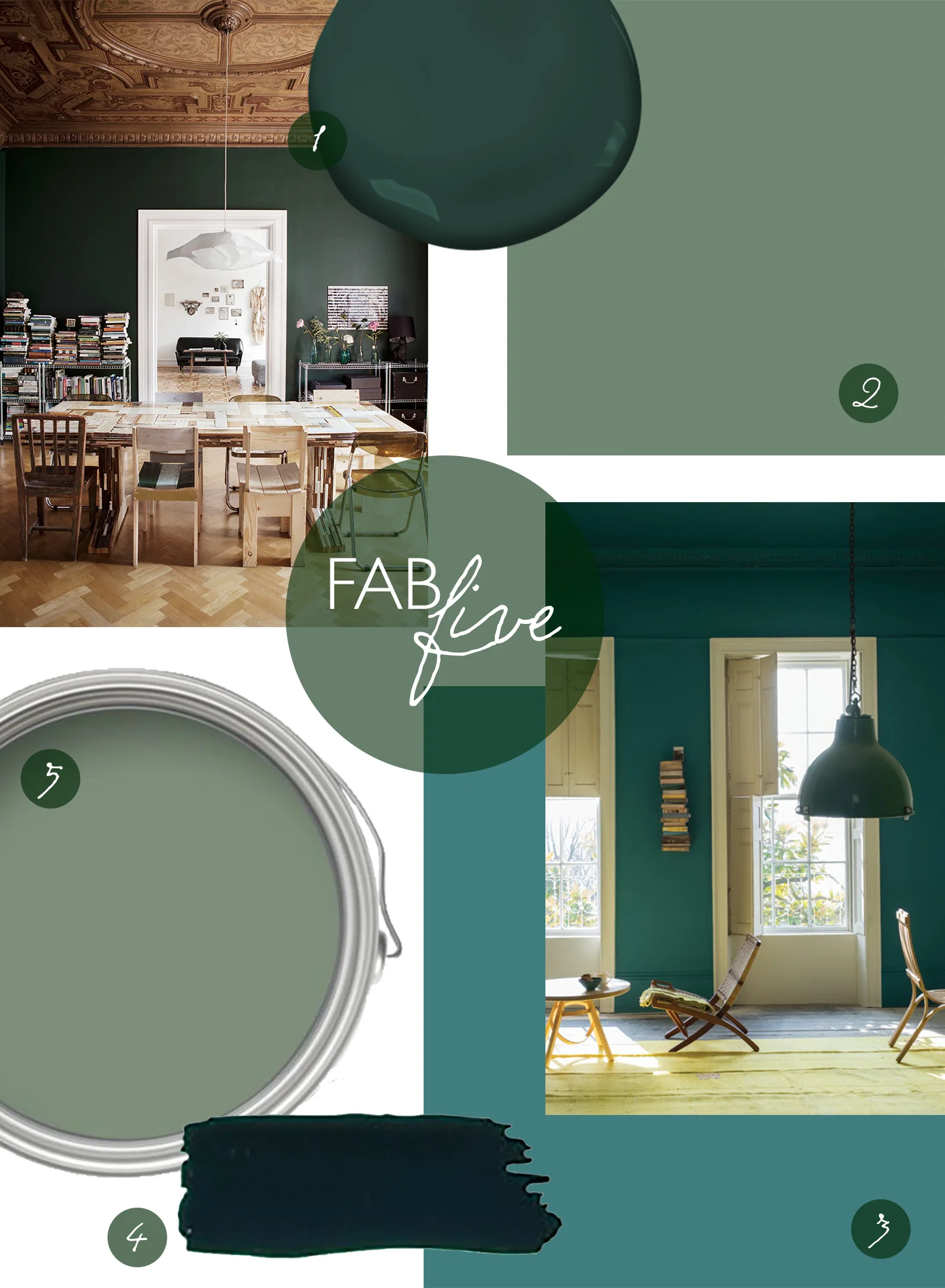
Fab Five: Our Fave Green Paint Colors

CLOTH & KIND Interiors // Fab Five Green Paint

We can't seem to get enough green in our design projects lately.

Pantone's 2017 color of the year is Greenery, a vibrant and cheery hue, but we here at CLOTH & KIND distinctly bend towards the moodier shades. Take a look at each of our favorites and let us know what your can't-live-without shade is... We're always on the hunt for our next go to hue.

1. Rachael's Pick // Benjamin Moore // Hunter Green // 2041-10
2. Kaitlyn's Pick // Sherwin Williams // Gallery Green // SW 0015
3. Tami's Pick // Farrow & Ball // Vardo // No.288
4.  Alyson's Pick // Fine Paints of Europe // Coach Green // 3015
5.  Krista's Pick // Farrow & Ball // Card Room Green // No.79

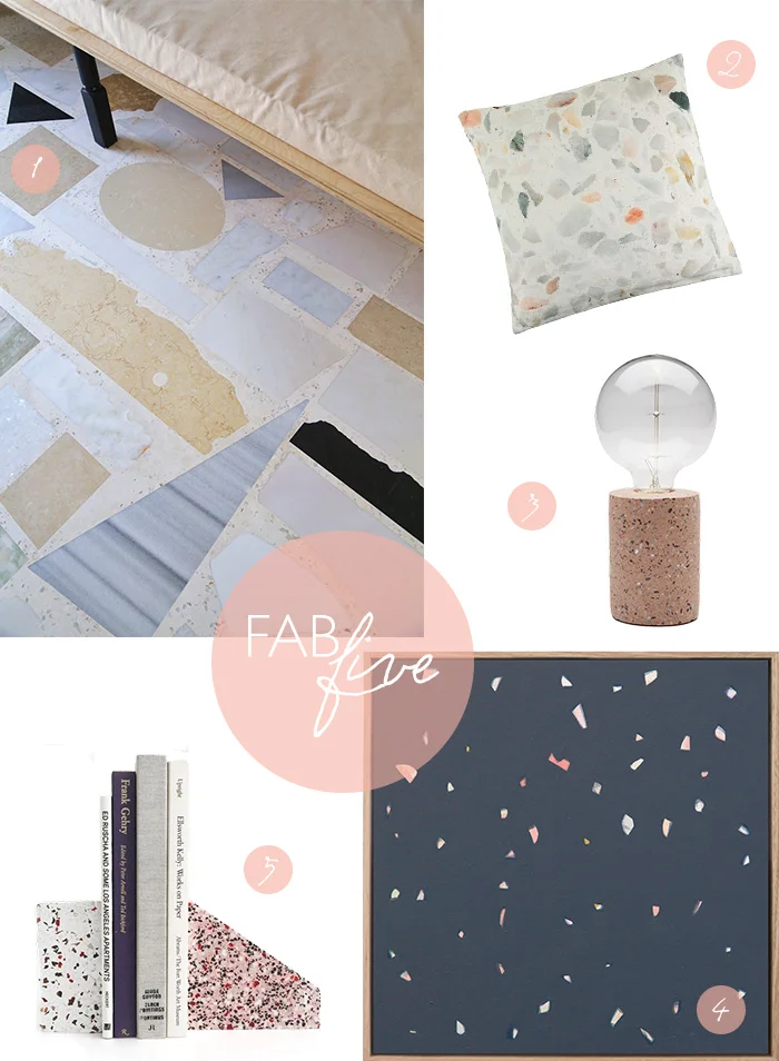
Fab Five: Terrazzo

CLOTH & KIND Interiors // Fab Five Terrazzo

1 | 2 | 3 | 4 | 5

CREDITS // AREA - Architecture Research Athens
PHOTO // I. Roufopoulou
WEBSITE // www.areaoffice.gr

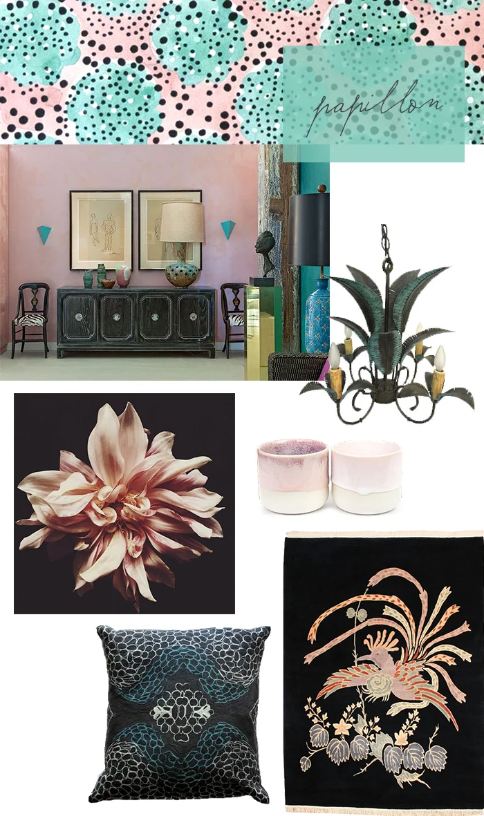
Hue: Papillon

CLOTH & KIND Interiors // Papillon

Fabric: Dessin Fournir's Papillon Hand Painted Silk Panels in Turquoise & Pink // Chandelier // Cups // Rug // Pillow // Photo // Angie Hranowsky Interior

Here at CLOTH & KIND, we're all presently obsessing over this stunning handmade silk fabric from Dessin Fournir called Papillon. Since you need designer credentials to enter their site and not everyone reading this may be able to do so, we wanted to share a bit more about it... Jean Papillon I, woodblock engraver and master domino maker, was the founder of the Paris Papillon workshop and brainchild behind this 18th Century movement. Papillon combines pencil drawing with watercolor painting and silk screen printing. It is available in four colorways. Isn't it a stunner?!

Bespoke Wallpaper Collaboration with Paper Mills for Serenbe

This Thursday, September 8, 2016 marks the VIP opening (consider yourself cordially invited) of the annual Atlanta Homes & Lifestyles' Serenbe showhouse... and the debut of our first ever product design (EEEK!), a bespoke wallpaper mural based on our interpretation of a modern southern landscape, which we created in deep, soulful collaboration with one of our favorite artists & wallpaper designers, Amy Mills of Paper Mills in California. 

We cannot wait to share loads of images with y'all from the event at Serenbe later this week, and you'll certainly see it in print in the December issue of AH&L, but in the meantime please take a few moments to follow our cross-country creative collaboration journey with Amy in this absolutely lovely short film about the project. 

You can also follow along with the hashtags #serenbetextilelofts &  #clothandkindpluspapermills on Instagram but we definitely hope to see you in the flesh on Thursday night!