Jared Hughes, a wildly talented designer and lovely friend of ours, has us totally gobsmacked over his bedroom in this year’s Southeastern Designer Showhouse. From his beautiful use of Décors Barbares textiles to the ornate detailing of his custom wallpaper collaboration with Gracie Studio, we were thrilled to learn more about Jared’s inspiration and creative process for this project.
Palette No. 53
Today's Palette includes textiles from two brilliant textile designers who both also happen to be Proust on Design alumni, John Robshaw & Lulu DK. You can read each of their responses to our infamous questionnaire here and here.
TOP RIGHT // Poppy in Silver from Lulu DK for Duralee (#64002LD-2)
BOTTOM RIGHT // Sarwan in Stone from John Robshaw for Duralee (#DU15763-435)
MIDDLE LEFT // Nizam in Indigo from John Robshaw for Duralee (#15752-193)
Palette No. 51
TOP RIGHT // Pétra Wallpaper in Albatre Jaune Orange from Casamance (#7291 03 82)
BOTTOM RIGHT // Stratum Rug from Verde Home (#951)
CENTER LEFT // Fez in Gold/Natural from Peter Dunham Textiles (#111FEZ04)
TOP LEFT // Leather Hide from Bernhardt (#163-012)
Palette No. 47
TOP RIGHT // Sahara in Copper Gold from Kufri (#n/a)
BOTTOM RIGHT // Sabu in Beige & Red from Rose Cumming by Dessin Fournir (#5562/05)
LEFT // Wolf in Shady from de Le Cuona (#WOL2)
No. 45
TOP LEFT // Selvedge in Paper from Laura Lienhard (#N/A)
TOP RIGHT // Cashmere in Biancore from Loro Piana (#INCASA70487)
BOTTOM RIGHT // Frida in Blanc from Manuel Canovas (#4710-01)
BOTTOM LEFT // Crescent Wallpaper in Taupe/Putty by Kelly Wearstler for Lee Jofa Groundworkds (#GWP3304-611)
Palette No. 42
We had a visit from our Donghia rep this week and were completely enchanted with Pierre Frey's Spring 2015 Origines collection, which is a textile tribute to indigenous tribes from around the wold. Sandy, with its embroidery and shells, is a motif based on the necklaces made and worn by Aboriginal people and Kagura is a printed linen toile depicting partially overlapping traditional Japanese theatre masks in bold colors. Gorgeous, no?! We paired these two stunners with a versatile new Dominique Kieffer tweed and simply adore the fact that its salvage can be cut and used as a brush trim.
LEFT // Sandy in Lin/Corail from Pierre Frey (#F3022002)
MIDDLE // Kagura in Tutti Frutti from Pierre Frey (#F3009001)
RIGHT // Tweed Couleurs in Laguna from Dominique Kieffer by Rubelli (#17224-02)
No. 27
MAIN | Puff in Lapis & Berry from carletonV (#429065) TOP RIGHT | Vintage in Sand from Larsen (#8852-01) MIDDLE RIGHT | Barmillion from Fermoie (#L-002)
We had a bit of a subliminal dragon theme going on while we were out and about in LA on our recent BlogTourLA adventure (btw, you can check out all of our BlogTour fun here). It seemed that every which way we looked we found another little dragon-inspired something-or-other. And it all started when we saw this crazy beautiful new carletonV print, aptly named Puff. We're quite fond of Puff and wanted to also show you this image of him below, since he himself wasn't included in the memo we received and used above. Isn't he darling?
So what do you think, would you put dragons in your interior space... or better yet, have you already? Tell us of your love or hate of this mythical fire-breathing beast. We have a feeling that most people fall pretty firmly in one camp or another on this topic.
Palette No. 23
For the specific fabrics used in Palette No. 23, please subscribe to CLOTH & KIND’s emails. Details for each textile are provided exclusively to our email friends. Happy Friday!
Applique from Holland & Sherry
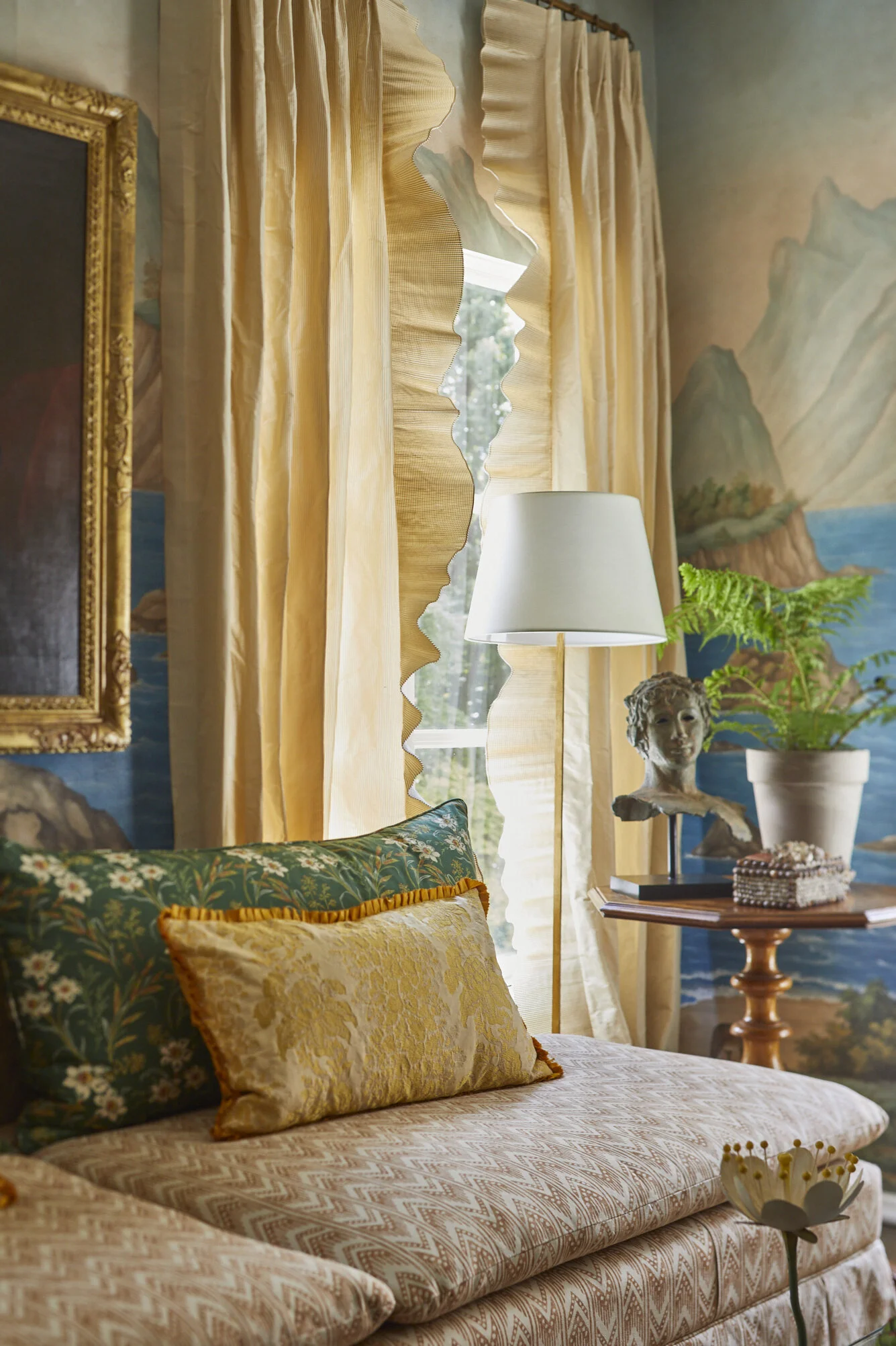
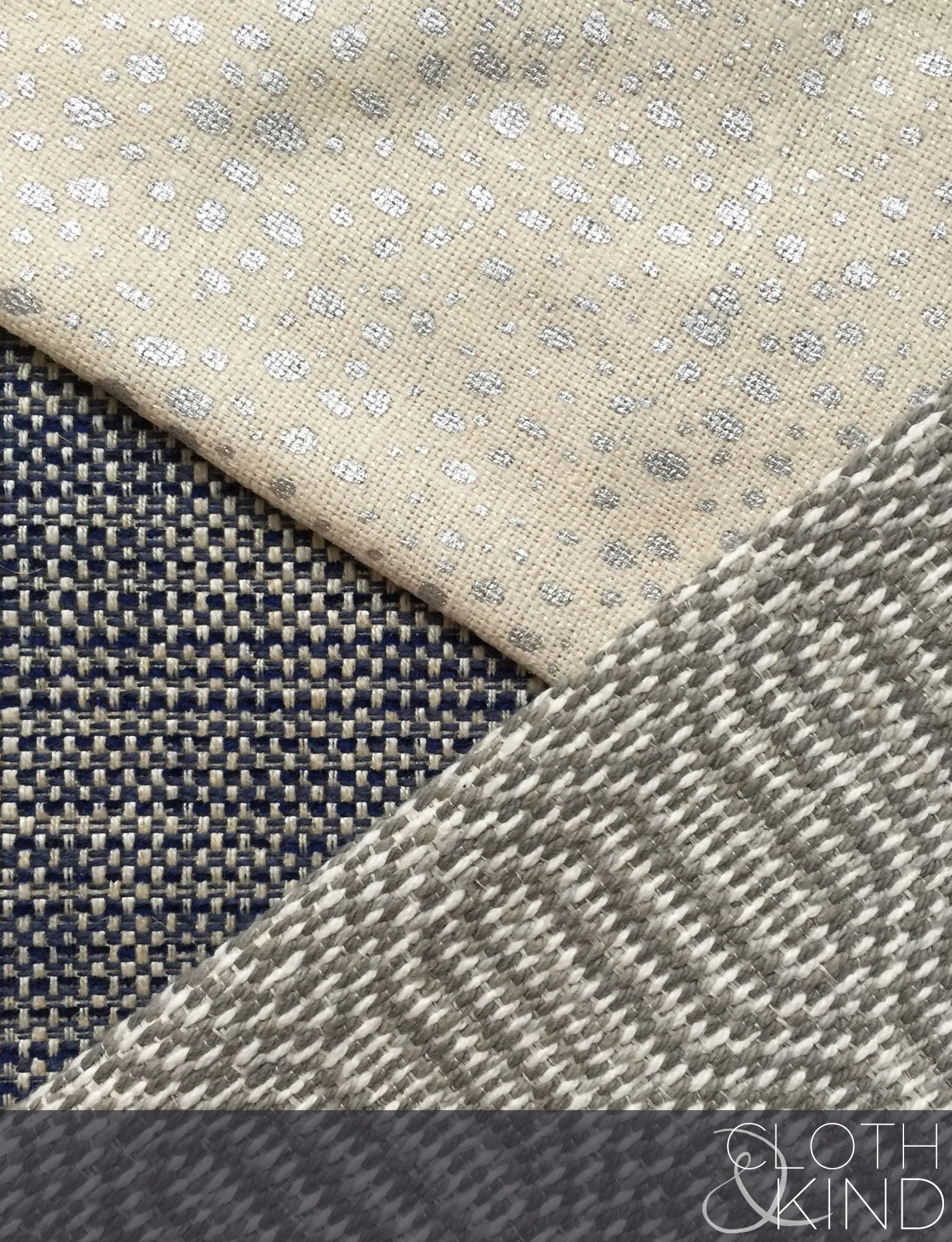
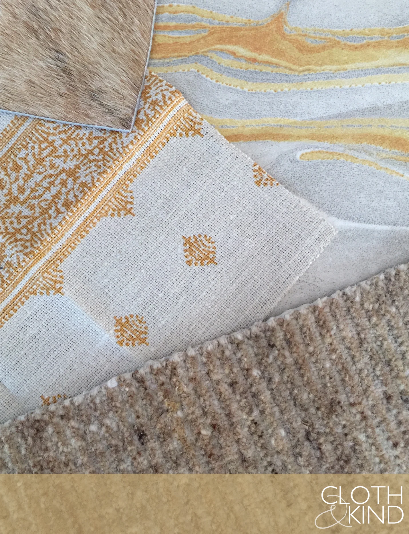
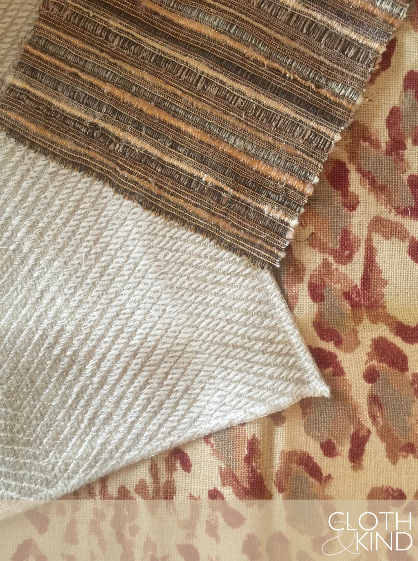
We are total and complete suckers for the littlest of details, which is why we are big old fans of the Holland & Sherry showroom. They carry so many of our favorite to-the-trade lines, plus their own line is divine. Like the exquisite Nara applique shown above - how amazing is this?!
We are also immensely appreciative of the fact that their website (relaunched and improved as of today) shows such incredibly detailed photos of each textile. It's this kind of attention to detail, both in their product and in the care they have taken to put together such a fantastic online resource that differentiates them from the rest and keeps designers like Tami and me coming back over and over again. Oh, and we also just adore our rep in Chicago - Michael Madalinski (hi, Mike!)
Who else out there in the design world is doing a great job at the tiniest of details? There are many, we know, and we'd love to hear your input.
Palette No. 21
For the specific fabrics used in Palette No. 21, please subscribe to CLOTH & KIND’s emails. Details for each textile are provided exclusively to our email friends. Happy Friday!